Strategy Four: Digital Tailoring

Workshop with Dan Michaelson

04 – 08 May 2015
The Brief

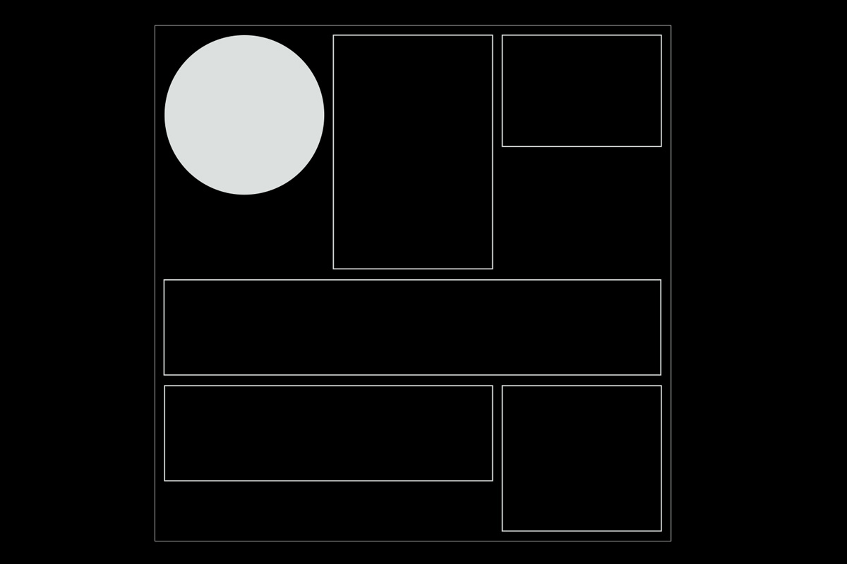
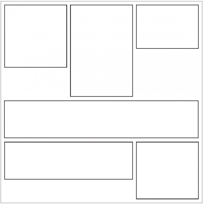
Start by considering a website 960 pixels wide. Imagine it’s divided into 3 columns, with 18 pixel gutters in between, and 18 pixel margins around the page. Thus each column is 296 pixels wide.

We will suspend a content management system from this scaffold. Students will organize into pairs of two. Each pair will invent one “module” for our content management system. Your module should have a width 1, 2, or 3 columns wide (296 pixels, 610 pixels, or 924 pixels). Its height may be fixed, or variable depending on its content. You may also allow authors to choose the width (1, 2, or 3 columns).

Your module should probably accept basic input from content authors. Within the module, you must define one or more fields (a “schema”) for that input. Each field may be one of the following content types:

– Text (single line, with Markdown formatting)
– Text (multi line, with Markdown formatting)
– Checkbox to turn an option on or off
– Radio buttons to Choose One Option
– Image upload (PNG with transparency, JPG, or animated GIF)
– Video upload (MP4, compressed for web)
– Audio upload (MP3)
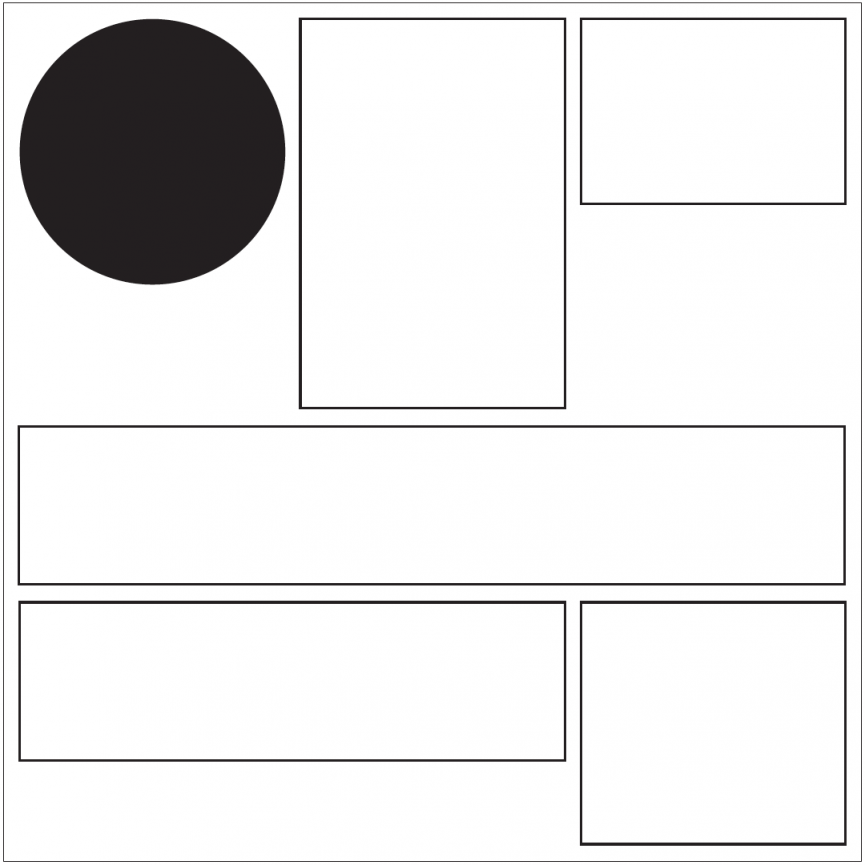
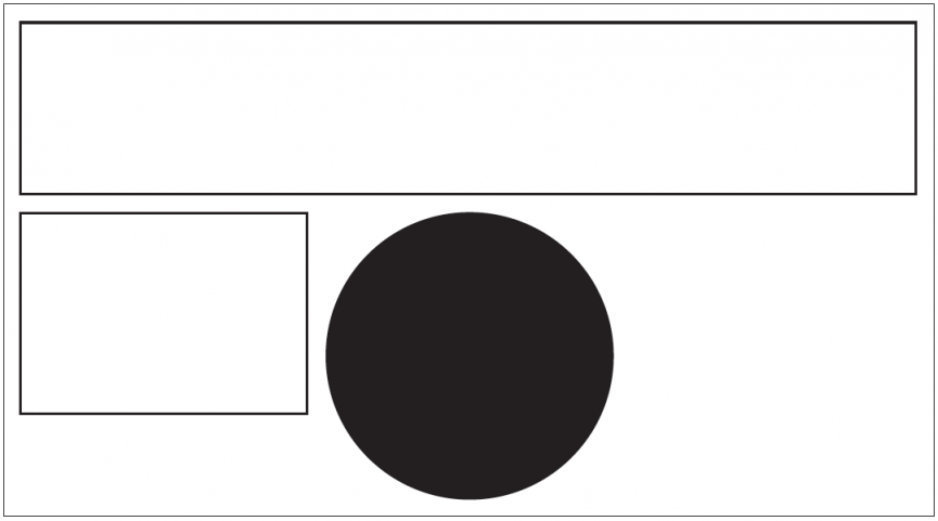
In theory a module can have any number of input fields. In practice it should probably have just a few. Then again, it need not have any input fields at all. For example, your module might always present a solid black circle of fixed dimensions and that’s it. We could call it “Black Circle Module”. Or, it might have radio buttons that let users choose the color of the circle, from a palette you define. We could call it “Circle Module”.

The design of your module must be very simple, and easy to achieve with HTML and CSS! Because, I’ll be programming it for you. And I’m not a very good programmer.
(This is called “minimizing your technical debt”.)

Give your module a name. Content authors will be able to add any combination of modules to a page, and rearrange them in any sequence. And within each module, authors will be able to populate whatever content is permitted by that type of module.

Goals of the system
We’ll use this system to make a website that illustrates cities. New pages (new cities) may be added to our website over time. And we’ll begin with a page about New York. You may wish to use the language of New York’s various urban systems as inspiration for the visual design, and content schema, of your module. Or you may wish to use Lausanne’s language, or your home city’s, or a synthesis. Once it’s deployed, your module will be used not by yourself but by other authors (your classmates, and future authors), to describe not only New York but also other cities. It may be used once or many times on a page, or not at all on a page if a city’s page doesn’t need it.

Questions to consider
Considering New York City as a network, how can you translate your observations there – including your observations of various networked languages there – into the invention of a design language that can hold other content?

Explore the relationship between parts and the whole in a collaboration between multiple designers, content authors, and end users. How can we let the meaning of the whole evolve as we invent – and continually revise – a basic kit of parts?

Explore the relationship between designer, author, and user in a system engineered to grow and evolve over time. What is your role as a designer in such a system? And how much freedom do you want to give to authors?

Explore the relationship between a “schema” or data structure, and a visual design.

What are some casual or unofficial structures in the system we’re working on? What are some more rigid or official structures? Could you consider this system as a kind of republic, and if so, how can you influence the qualities of this republic?

Workshop Outcome

Directional Module, Jagoda Wisniewska

The Directional Module slideshow gives a sense of the New York City grid system. Depending on which area the image was taken in, the slideshow animates in a different direction. For example, if one image was taken in the south and the next in the north, it would animate to give you the feeling that you are moving up the grid. The colours correspond with the colours of the subway lines in anarea.

Output of the module
Back end of module

Fragments Module, Simon Mager

My module aims to echo textures and surfaces I collected during our trip to New York. It shows only a fragment of a picture, in a rectangular area, thus emphasizing the texture of the image. The user is invited to explore the different parts of the image through moving the mouse. This creates a new and unexpected way of experiencing images on a website, because they start moving as soon as one moves the mouse. In fact, users begin exploring before they are aware, as there is unusual movement on the page which takes them time to realise they can control.

Output of the module
Back end of the module

Look Up/Down Module, Johannes Bauer

While in New York I photographed a series of details and textures looking up and down while discovering the streets of Manhattan. I wanted my module to reflect these discoveries on the website. My module is activated by clicking on the text located in the corners of the website, activating the slideshow. There are two modules, on at the top and one at the bottom of the page. These modules act as a metaphor for the entire city: you have the very tops of sky scrapers, and the pavement and below, and the rest of the website is everything else in between.

Output of the module
Back end of the module

Pick 3 Module, Ana Cuba

Module is based on 24 key words/tags that relate to the images I shot while in New York. As a user, you can click on three words/tags, which then dynamically generate a selection of images in a slideshow.
Output of the module

Latest Resources

✂ Copy and ? Paste Emoji ?
getemoji.com

No apps required.

Computer Virus Catalog
computerviruscatalog.com

They steal our files, corrupt our hard drives and destroy our lives. We scan. We block. Do everything we can to prevent infection. Computer viruses. We hate ’em. Nevertheless, we remain fascinated by their evil plots. This fascination led to a new kind of art collection – Computer Virus Catalog. The worst viruses in computer history interpreted by artists around the world.

Founded & curated by Bas van de Poel

Scrolling on the web: A primer
blogs.windows.com

Scrolling is one of the oldest interactions on the web. Long before we had pull-to-refresh or infinite-loading lists, the humble scrollbar solved the web’s original scaling problem: how can we interact with content that’s stretched beyond the available viewport?

Resilient web design
resilientwebdesign.com

Resilient Web Design, you might think that this is a handbook for designing robust websites. This is not a handbook. It’s more like a history book.

A Handmade Web
luckysoap.com

‘handmade web’ to refer to web pages coded by hand rather than by software…

Eloquent JavaScript
eloquentjavascript.net

This is a book about JavaScript, programming, and the wonders of the digital.

The Future of Browser History
medium.freecodecamp.com

About browsers history, and how we tend to browse nowadays.

Swiss in CSS
swissincss.com

Swiss in CSS is a homage to the International Typographic Style and the designers that pioneered the ideas behind the influential design movement.

Automatically art-directed responsive images
cloudinary.com

by Eric Portis

WHAT IS CODE?
bloomberg.com

Businessweek, June 11, 2015
by Paul Ford

Interview with Tom Krcha, Adobe XD
subtraction.com

Adobe released the first public preview of what the company is now calling Adobe XD, its their major new UX/UI design and prototyping tool.

Typography for User Interfaces
viljamis.com

A recap of how far type in UI has come, where it’s going (VR) and what to look for when choosing a workhorse for your next interface. (via Atomic.io)

Typeface As Programme: Glossary
typotheque.com

A glossary of tools and technologies mentioned in Typeface As Programme.
by Jürg Lehni

Declarative Design Tools
jon.gold

Our brains and computers are fast; our hands, mice and keyboards are slow.

Roger That: Emoji Overdrive
ia.net

A font that turns the 2,000 most used English words into emoji.

Layout in Flipboard
engineering.flipboard.com

Flipboard Pages, a layout engine that turns web page articles into magazine pages for the iPad.

Use Your Interface
uyi.io

UYI, is a place documenting the uprising of motion based interface patterns.

Google Fonts
fonts.google.com

Google’s new site for Web fonts.


New Yorker cover comes to life
itsnicethat.com

Malika Favre’s illustration for this week’s New Yorker magazine has been brought to life by French animator Mathieu Maillefer.

Natural User Interface

In computing, a Natural User Interface (NUI) is the common parlance used by designers and developers of human-machine interfaces to refer to a user interface that is effectively invisible, and remains invisible as the user continuously learns increasingly complex interactions. The word natural is used because most computer interfaces use artificial control devices whose operation has to be learned.

Graphical user interface

In computing, a graphical user interface (GUI, sometimes pronounced “gooey” or “gee-you-eye”) is a type of interface that allows users to interact with electronic devices through graphical icons and visual indicators such as secondary notation, as opposed to text-based interfaces, typed command labels or text navigation. GUIs were introduced in reaction to the perceived steep learning curve of command-line interfaces (CLIs), which require commands to be typed on the keyboard.

Parallax scrolling

Parallax scrolling is a special scrolling technique in computer graphics, wherein background images move by the camera slower than foreground images, creating an illusion of depth in a 2D video game and adding to the immersion.
Web designers began incorporating parallax scrolling in 2011, using HTML5 and CSS3. Websites with parallax backgrounds are becoming an increasingly popular strategy, as advocates argue it is a simple way to embrace the fluidity of the Web.

WebGL

A Web Graphics Library (WebGL) is a JavaScript API for rendering interactive 3D computer graphics and 2D graphics within any compatible web browser without the use of plug-ins. WebGL is integrated completely into all the web standards of the browser allowing GPU accelerated usage of physics and image processing and effects as part of the web page canvas. WebGL elements can be mixed with other HTML elements and composited with other parts of the page or page background.

Twitterbot

A Twitterbot is a program used to produce automated posts on the Twitter microblogging service, or to automatically follow Twitter users. Twitterbots come in various forms. For example, many serve as spam, enticing clicks on promotional links. Others post @replies or automatically “retweet” in response to tweets that include a certain word or phrase. These automatic tweets are often seen as fun or silly. Some Twitter users even program Twitterbots to assist themselves with scheduling or reminders.

UEM

User experience moment.

Usability

Usability refers to how easy it is for a visitor to your site to use your site in its intended manner. In other words, are navigation, content, images, and any interactive elements easy to use, functioning the way they were intended, and that your intended target visitor will not need any special training in order to use your site.

Permalink

Short for “permanent link.” Generally used only on blogs, a permalink is a link that is the permanent web address of a given blog post. Since most blogs have constantly-changing content, the permalink offers a way for readers to bookmark or link to specific posts even after those posts have moved off the home page or primary category page.

Pageview

A pageview is a request for an entire web page document from a server by a visitor’s browser. In other words, for each page view your site had, someone (or a search engine spider) looked at that page.

Meta data

Meta data is the data contained in the header that offers information about the web page that a visitor is currently on. The information contained in the meta data isn’t viewable on the web page (except in the source code). Meta data is contained within meta tags.

Hypertext

Hypertext is any computer-based text that includes hyperlinks. Hypertext can also include presentation devices like tables or images, in addition to plain text and links.

Hyperlink

A hyperlink is a link from one web page to another, either on the same site or another one. Generally these are text or images, and are highlighted in some way (text is often underlined or put in a different color or font weight). The inclusion of hyperlinks are the “hyper” part of “hypertext.”

Hit

Contrary to popular belief, a hit does not represent a single visitor to a website. A hit is actually a request for a single file from your web server. This means one page can actually generate multiple hits, as each page generally has more than one file (an html or other base file, a css file, multiple images, etc.) and each one is requested from the server whenever the page is loaded. Some marketing people like to quote hits to unknowing consumers as the number makes their site sound like it’s getting a whole lot more traffic than it actually is.

Focal Point

The focal point of a web site is the spot on a web page that they eye is naturally drawn to. This could be an image, a banner, text, Flash content, or just about anything else. You want to make sure that whatever is acting as your focal point is the most important part of your site.

Fixed Width Layout

A fixed width layout has a set width (generally defined in pixels) set by the designer. The width stays the same regardless of screen resolution, monitor size, or browser window size. It allows for minute adjustments to be made to a design that will stay consistent across browsers. Designers have more control over exactly how a site will appear across platforms with this type of layout.

Elastic Layout

An elastic layout is one that uses percentages and ems for widths paired with a max-width style to allow the site layout to stretch when font sizes are changed. It’s ability to flex to accommodate the browser width and reader’s font preferences are where it gets its name.

Cascading Style Sheets

Also referred to simply as CSS, Cascading Style Sheets are used to define the look and feel of a web site outside of the actual HTML file(s) of the site. In recent years, CSS has replaced tables and other HTML-based methods for formatting and laying out websites. The benefits to using CSS are many, but some of the most important are the simplification of a site’s HTML files (which can actually increase search engine rankings) and the ability to completely change the style of a site by changing just one file, without having to make changes to content.

Cache/chaching

Cached files are those that are saved or copied (downloaded) by a web browser so that the next time that user visits the site, the page loads faster.

Bounce rate

A website’s bounce rate is the percentage of people who leave the site from the same page they entered the site, without clicking through to any other pages. This can be a good indicator of how good a website’s navigation is, as well as an indicator of the quality of the site’s content (a very high bounce rate doesn’t bode well for either of those things).

AJAX

Stands for Asynchronous JavaScript and XML. AJAX is typically used for creating dynamic web applications and allows for asynchronous data retrieval without having to reload the page a visitor is on. The JavaScript on a given page handles most of the basic functions of the application, making it perform more like a desktop program instead of a web-based one.