The term magazine was first applied to a printed periodical in 1731, when the Gentleman’s Magazine was produced in Clerkenwell, London, a few hundred metres from where I'm writing this. Like other periodicals of the time, it owed its existence to the new printing technology.
[caption id="attachment_676" align="alignleft" width="1000"]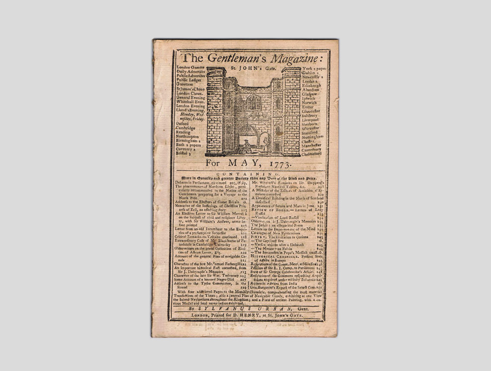 Caption added automatically[/caption] For the 200 years since, technological change has continued to shape publishing. Better inks, papers, typography and ever- improving print reproduction, first bringing line art images, then halftones, spot colour, and four-colour lithography, enhance the print experience.
When in the 1990s the means of production ended up in a single desktop box with the Apple computer, the search for a publishing system that could work on screen began. Initial experiments with hyperlinks and hypercard ran alongside the very first web pages. There wasn't yet a name for the discipline but these early experiments inevitably attracted publishers who could see the link between print and screen.
My first introduction to the world wide web came at this time via the tiny Apple Mac Plus computer lent to me by Tony Elliott, owner of Time Out magazine where I was art director (around the same time he also gave me a copy of the launch issue of Wired magazine). There was a new world here, but what was it?
[caption id="attachment_682" align="alignleft" width="569"]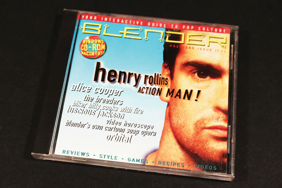 Caption added automatically[/caption] An attempt at an answer arrived in the form of US music magazine Blender. Launched in 1994, Blender combined a traditional editorial approach with new technology; it was a CD-rom mounted on a magazine-sized piece of card for distribution on the newsstand. It used Macromind Director, an early digital animation program, and had a crazy design based on the then popular Kai’s Power Tools Photoshop plug-in and a navigation system to match. It looked pretty hideous, to be frank, but the idea, a magazine that worked only on the screen, appealed to me.
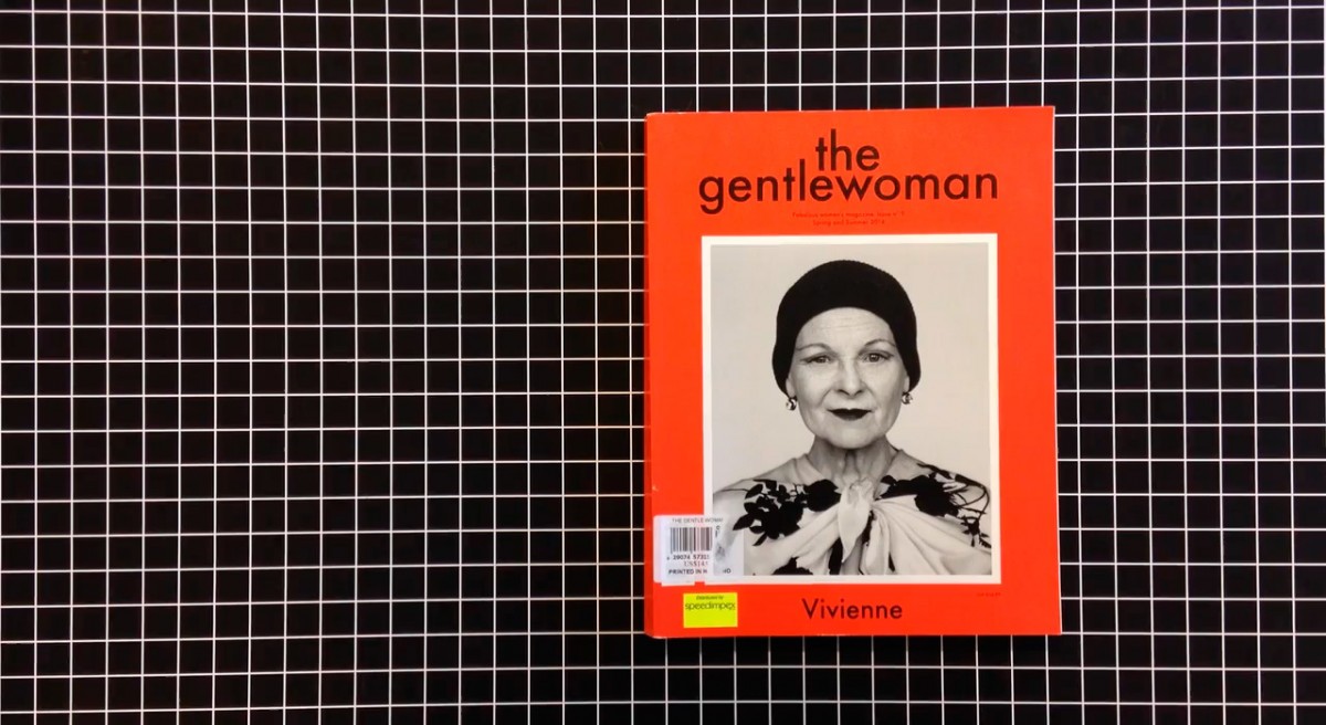
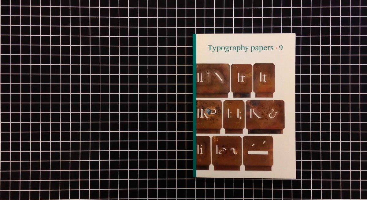
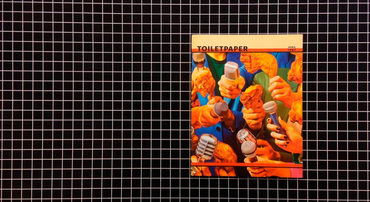
While working for various magazines I had developed an interested in experimental publishing, in particular magazines that challenged what a magazine might be. From sixties art surprise box Aspen to its nineties commercial descendent Visionaire and on to today’s Ordinary and Voortuin, I am fascinated by how the apparent straitjacket of ‘magazine’ can be stretched. Jumping off the page and onto the screen appealed to me on this simple level: what might a digital magazine consist of?
Blender failed to find an audience, reverting to a regular print format after 15 issues. Likes others that experimented with CD-rom publishing, Blender was limited by the computing power of the time and by the resulting either-or decision making processes it was able to offer. It was slow, unintuitive and, importantly, just not as easy to use a print magazine. Video and audio stuttered. In the end it was a gimmick, and one that is unviewable today – does your current computer even have a CD-drive? But the *idea* appealed — how could you transfer a magazine sensibility to the screen?
A generation later, similar hopes and promises surrounded the launch of Apple’s iPad. This seemed to offer to publishers the promise of paid digital content.
Many magazine publishers had been stung by the late 90s dot com bubble, a time when a magazine and newspapers mistakenly applied their print model (collect as many readers as possible to appeal to advertisers) to the new online sphere. But this proved to be huge mistake; vast sums were spent on consultants and designers with almost zero income. The iPad was set to change this, since apps were paid-for items, like a print magazine.
My pre-order iPad arrived on the first day it was available in the UK. It was thrilling, a beautiful metal and glass object unlike anything I’d seen before. The pre-retina colours were vivid and bright, and the first magazine app, US Wired, looked amazing on the glossy screen. Animation, video and audio brought to life designs based on the much-admired print edition of Wired.
[caption id="attachment_678" align="alignleft" width="800"]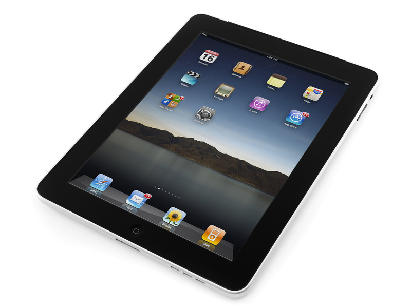 Caption added automatically[/caption]
Wired’s creative director Scott Dadich worked closely with Apple and software developer Adobe to build the production framework for the app. As supplier of the industry-standard layout program InDesign, Adobe were ideally placed to create a new digital production tool and working with Dadich they created Adobe Digital Publishing System, a plug-in for InDesign that theoretically allowed print designers to transfer their designs into the digital realm in the form of an iPad app.
I worked with the beta version of DPS on a project for men’s magazine Port. It was at once liberating and depressing. It was soon clear that it was a developers project rather than a designers project, and while the hook in to InDesign was a necessity that has been improved on since by other app systems, the structural limitations built in from the start by the Wired team left some huge navigational issues unresolved. That’s not to belittle their contribution, it was necessary experimentation. But ultimately it was to prove to be a huge distraction.
Most frustrating to me was the need to separate content and controls. What I love about magazines is the seamless melding of content and design so that the two forms of visual engagement – looking and reading – are one. DPS, though, required a third layer of visual interaction, the button/control. I tried hard to hide the clumsy presences of button and scroll information but it just wasn’t possible.
[caption id="attachment_681" align="alignleft" width="1000"]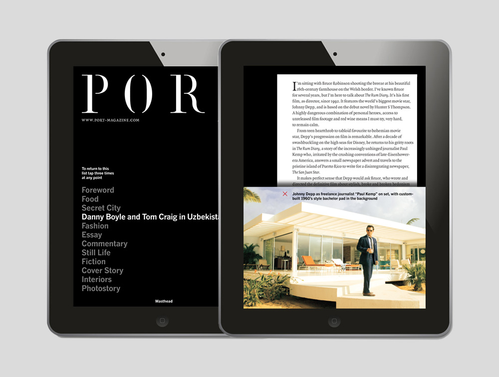 Caption added automatically[/caption] For the second issue of the Port app I worked with a brilliant coder, Tim Moore, to write our own base code that allowed design and navigation to be one. This was far harder in some respects, but the results were more satisfying. Simple words could be buttons, actions relied on intuition rather than highlight.
In the end, though, the iPad app has struggled to find a significant paying audience. The initial hopes of publishers were dashed by the complexities of production (the assumption existing teams could fit app creation into already packed workflows was wrong) and, vitally, a fundamental lack on interest from the public.
There are exceptions – I designed the Frieze magazine app, and their global audience benefit from receiving the magazine digitally long ahead of the print edition and in a form they can easily travel with. The Economist have benefitted from the similar requirements of its audience.
[caption id="attachment_679" align="alignleft" width="1000"]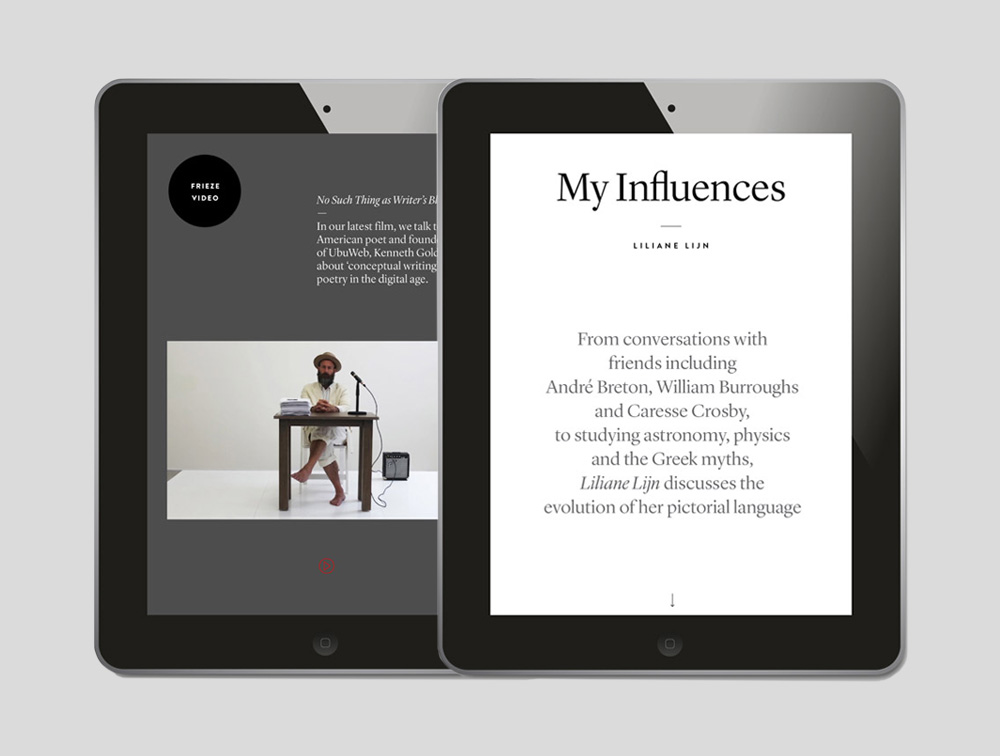 Caption added automatically[/caption] But essentially, the iPad magazine app has settled into a niche role. It has struggled for the same reasons that the original dot com bubble burst. There simply wasn’t money in the medium. Apple insisted on taking 30% of all sales, as they do with all apps, the app store was a hopeless space to search for magazine apps, and their screening process wasn’t suited to the monthly turnaround of magazines.
And just like the CD-rom magazines, it’s already impossible to view the early iPad apps due to multiple software updates rendering earlier files unusable. Whatever happens to the magazine app in the near future, that first Wired app deserves to be archived and accessible. For now it is not.
There remain plenty of magazines working with other suppliers to make simpler, HTML-based apps, of which PugPig and Mag+ are the most successful; but it’s a niche market in which the basic PDF app is the mainstay – PDF versions of the print magazine sold in app format. Efficient, but dull.
[caption id="attachment_683" align="alignleft" width="1350"]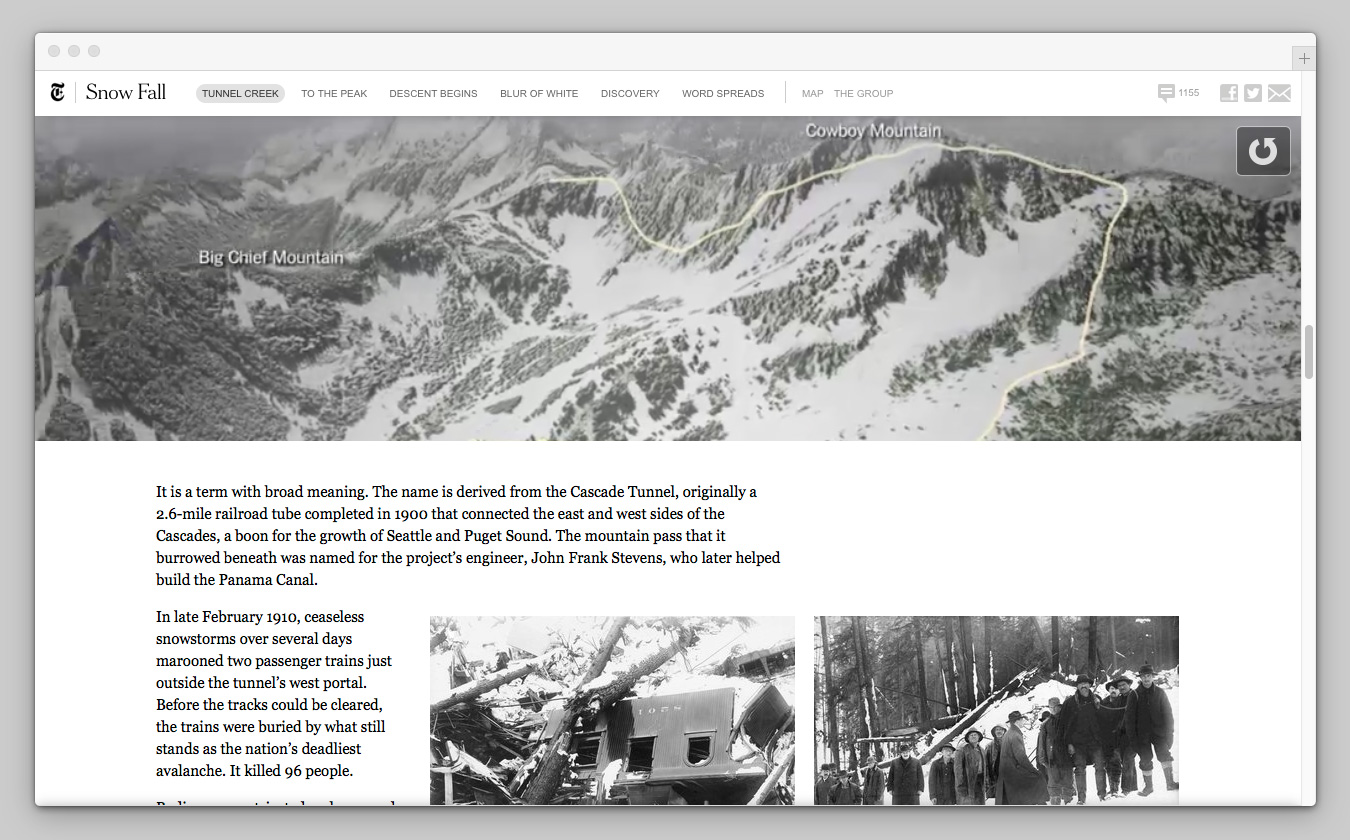 Caption added automatically[/caption] Advances in website design provide have improved the online experience outside the app: better font rendition with web fonts, combined with experimental parallax storytelling sites such as NYTimes Snowfall, successfully mix text, audio, image and video in a manner unimaginable til recently. Add the promise of virtual reality, another technology already being explored by the New York Times, and the iPad app drops further in relevance.
The speed of technological development also means that the smartphone is a more realistic environment than the tablet for digital content. The challenge here is the size of the screen; a consensus has developed round design for the small screen in terms of functionality (something that never happened for the tablet app). The challenge now for the designer is how to make your mobile site reflect your brand and have a different tone to your competitor. How do you add character and definition in such a small space without jeopardising its readability and function?
[caption id="attachment_677" align="alignleft" width="1000"]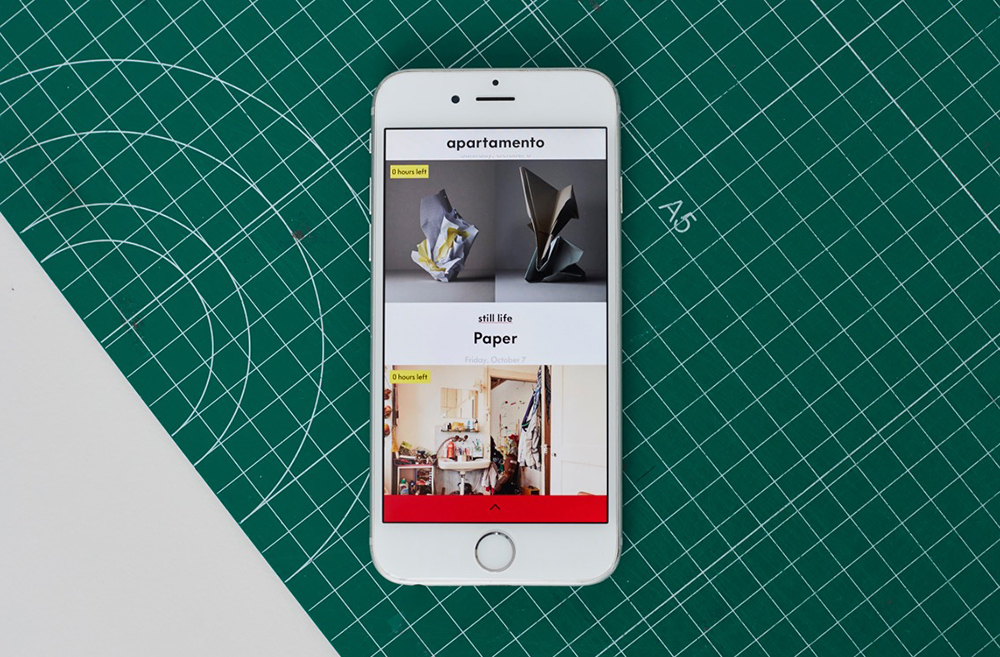 Caption added automatically[/caption] One interesting current phone app is Apartamento’s, with its content that times out after five days. The design does a good job of reflecting the print edition, but it is this content strategy that makes it stand out, and proves there is still scope for experiment in the digital space.
Despite such experiments, the digital magazine continues to fail as a popular medium. Print magazines continue to face huge problems in terms of their business model, but they remain creatively strong.
If someone had invented it today, the print magazine would be hailed as an advance on all digital magazine projects to date because of its ease of use (identity, navigation, extent, placement).
While the publishing industry has been trying to squeeze its traditional format into the digital space, elsewhere digital content has been thriving. Perhaps it’s all a matter of words: just as the 18th century publishers of The Gentleman’s Magazine adopted a French word meaning ‘storehouse’ for the title of their publication, maybe we need a new name for digital magazines.


