Strategy One: Visual Narratives
Interview with Jason Evans

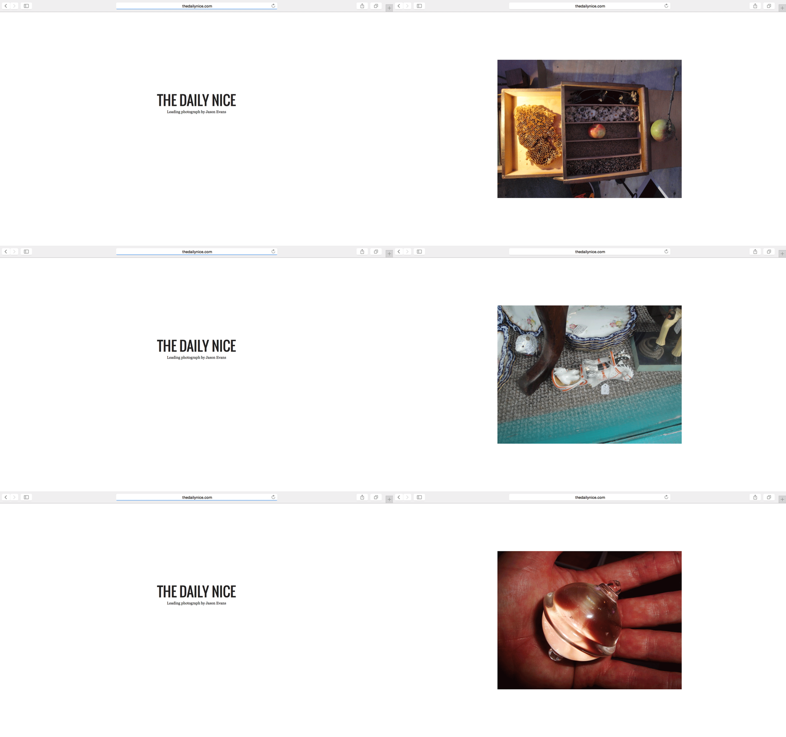
Jason Evans is a photographer producing portraiture and fashion imagery, and also working in the music industry. Jason is a lecturer on photography at the University College for the Arts in Farnham, UK, and has been working on the Internet’s potential for image circulation, notably through his website www.thedailynice.com.
What were the initial intentions of the workshop?
I feel that technology is making everything looks and feel the same. For this reason, one of the buzz words of the workshop was texture. Thinking about what texture actually means in relation to the image itself, to its production, to sequence, to audio. This helped students be very aware of the equipment they were using and why they were using it. I also wanted to create something that did not look as generic and formulaic as all those magazines I see around. Why does a magazine have to be monthly? Why does it have to have fashion in it? Why should it contain advertising? We got rid of all the type of stories that people expect in a magazine and we identified an idea instead. We chose to go back to meaningful content.
And how did you try to fulfill these intents?
We had a debate, we isolated stories and proceeded from there. The idea was that technology and content were two of the most important things that were going to lead this workshop. And then we had to extrapolate in relation to this idea of a narrative and what a narrative is. Finally, I thought it was essential that the content be ongoing and controlled by the students. Actually, one of their proposals was to take this workshop model and teach it themselves to the next first-year students. In that way, those students will be able to take some ownership of the site and provide further content. Hopefully, something will get lost in translation and a new version will emerge.
Can you elaborate on your idea of content?
If you look at the content on the internet, what is it? It’s always about money, sex, shopping, fears. But really, the only thing you have to do to create interesting content is be interested in it yourself. Communicate some of that passion and the content can be really simple. I am glad we haven’t made something that looks like my frames of reference. It’s been quite a good confidence builder as well.
How would you describe the narrative of this magazine?
It is definitely not a classic narrative. It reminds me of something that could have happened in the early twentieth century. It is maybe a bit dada and a bit surrealist. To me, that’s appropriate, because so much of the modernist era was about responding to new technology or new cultural and social circumstances and those are the kind of things that are happening now in a lot of art practice. But why isn’t it happening in magazines? The big problem with the narrative of most magazines these days is that it is consumed by the aesthetics. And the aesthetics are controlled by total, nostalgic freaks. There are so many people of my generation who are now working in magazines, just remembering and trying to recreate the good old days.
Is it different with the Digital natives ?
I think that people are far more visually literate. The difference between being visually aware and visually literate has to do with education and history. Visually literate people recognize things. They don’t necessarily recognize who made them or where they came from, but they recognize them. The narrative structure we have in the magazine facilitates the creation of people’s own narrative. They either will create one or they won’t. I think people from my generation are going to probably struggle a bit. But the younger generation find it much easier to skip from X, to Y, to F, to L, to blue, to trousers… to whatever. I mean, look at the way that young people consume music now. There are hardly any genre boundaries. The distinctions that were pertinent before, the rockers, the skinheads, the punks etc. are dissolving. The narrative structure of the site and the fact that the content is so choppy might be a bit odd. It’s definitely not an editorial standard. But once again, to a younger generation, the narrative structure is going to be quite exquisite as well as quite enjoyable.
So there was a lot left to chance?
I think chance is a useful strategy. You have to learn to trust. When you work with chance, you’re often making mistakes. You can then realise the creative potential from making a particular mistake. If you’re smart, you learn way more from making a mistake than from getting it right the first time. And if you create an environment where you encourage and allow chance and happy accidents or mistakes into the practice, then people become less self-conscious and more self-aware. To give you an example: since photography became primarily digital, we see an image on a screen and we can delete it straight away, if we don’t formally recognize it as being a good photo. Yet, so many visual forms have come about from people recognizing the potential in an accident. I refer to this as ‘visual eugenics’. At this rate, we are going to end up with only one image; the perfect image.
Why is it always important to keep a critical stance towards media ?
One of the genius ideas of digital media is that you don’t need any new content and you certainly don’t need to pay any content providers. There’s always going to be another generation coming along ready to discover Michael Jackson or the Beatles. You don’t need new bands, you just need to recycle the old ones and resell them over and over again. And they’re not even new products. Maybe we repackage them a bit or we invent a new kind of file as a way of delivering what has a perceived better audio quality. It doesn’t really matter. This is what terrifies me the most for the cultural sector; these platforms don’t need any more content. There’s enough content out there. Unfortunately, I feel that I know a lot of it. It’s very rarely that an aesthetic surprises me. When was the last time when you were delighted and amazed by a new aesthetic or you heard a record and it blew your ears off? I am talking about a contemporary piece of culture.
What is you posture regarding this situation ?
Take all these people; they are so self-absorbed. They are making what they think is their content, but actually, they are just miming. And they have to buy into all the hardware and the software to produce that stuff. Nowadays, it is not enough to take a few holiday snaps, you have to make your little video, and your short piece of music to go with it. Finally, you have to upload it, so that everyone can see it. And it doesn’t add up to anything. It’s really insignificant. In fact, what it adds up to is a whole bunch of nuclear power stations having to create more energy to support all those memories, hollowing out a few more mountains! We really have to live in a time where we have to be confidently aware that you’re either part of the cultural resistance or you’re not. You are compliant.
Can you describe your teaching strategy and how you applied it ?
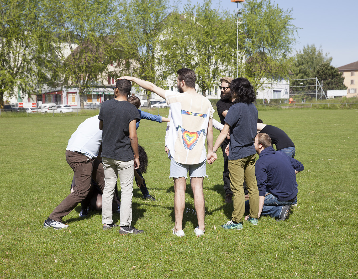
I always try to put myself in a position where I am learning and maybe, where I am slightly uncomfortable and a little bit vulnerable. And I don’t plan too much. Students can sense whether you are patronising them and going through the motions or whether you care. I believe that planning is one of the problems with a lot of contemporary education. People plan the outcome. With this workshop, I knew what the parameters were, but I didn’t have an expectation about what was going to be made. I started by throwing a lot of ideas around, trying to create a kind of confusion. Something filtered through the confusion and the project emerged. This was a somewhat risky attitude to take, but I had a very able, interesting and intelligent group of students, who were also very good at supporting one another.
What did you expect from the students ?
I asked them to involve themselves emotionally in the project and to come out of their comfort zone. I wanted them to challenge and especially, to invest themselves. Otherwise, how can the content be meaningful? If we started smelling something that smelt like a learnt or a borrowed experienced, we had to cancel it. It was also important that they were treated like authors and not just like technicians. I wanted them to evaluate and understand the relationship between their authorship and their technical skills. They had to take responsibility for their own learning. The cross fader moved from me initiating something to them leading the ongoing project more and more. I also encouraged them to be more intuitive. If anyone started thinking too much and not feel enough, I would shut it down and send them away to start again. It is clear that the ones that have been the most intuitive are the ones that have done the most interesting work.
You also resorted to regular editorial meetings, how did affect the dynamic of the workshop ?
Yes, organically we ended up working as a group and we had two to three meetings a day. If I did run a magazine, I would run it the same way. Yet, one of the reasons this workshop was successful was because the students had this solidarity. No one felt superior, no one felt undermined. They are a very gentle and intelligent bunch. All the guys in the group are quite passive, they don’t have a hang up about their masculinity. I think resulted in the women in the group feeling more confident about talking about their perspective on sex. We realised early on that gender was the glue that held everything in this group. And generally, when you work with students, the thing that links everybody together is money. But, money was off their chart. It didn’t even come up. And that’s a really interesting thing about this group of students. It’s really unusual for that to happen.
How did the outcome plan out for you?
One of the nice things about doing this workshop is that I had the freedom of the delivery. I did not feel that I had to deliver this workshop in a particular way. As I mentioned, the less planning I do, the more responsive and organic I am. This enables me to allow the situation to flow. It has also been very useful for me. I now have a lot of building blocks that I can take away and think about and play with. And I feel much more confident about the idea of making a structure free workshop. A few years ago, I was too wrapped up in contemporary pedagogical practice where you identify the outcome and the assessment criteria before you have even begun. I think that this is a dead form. It does not allow the participants their own form of development.
What’s next for this project ?
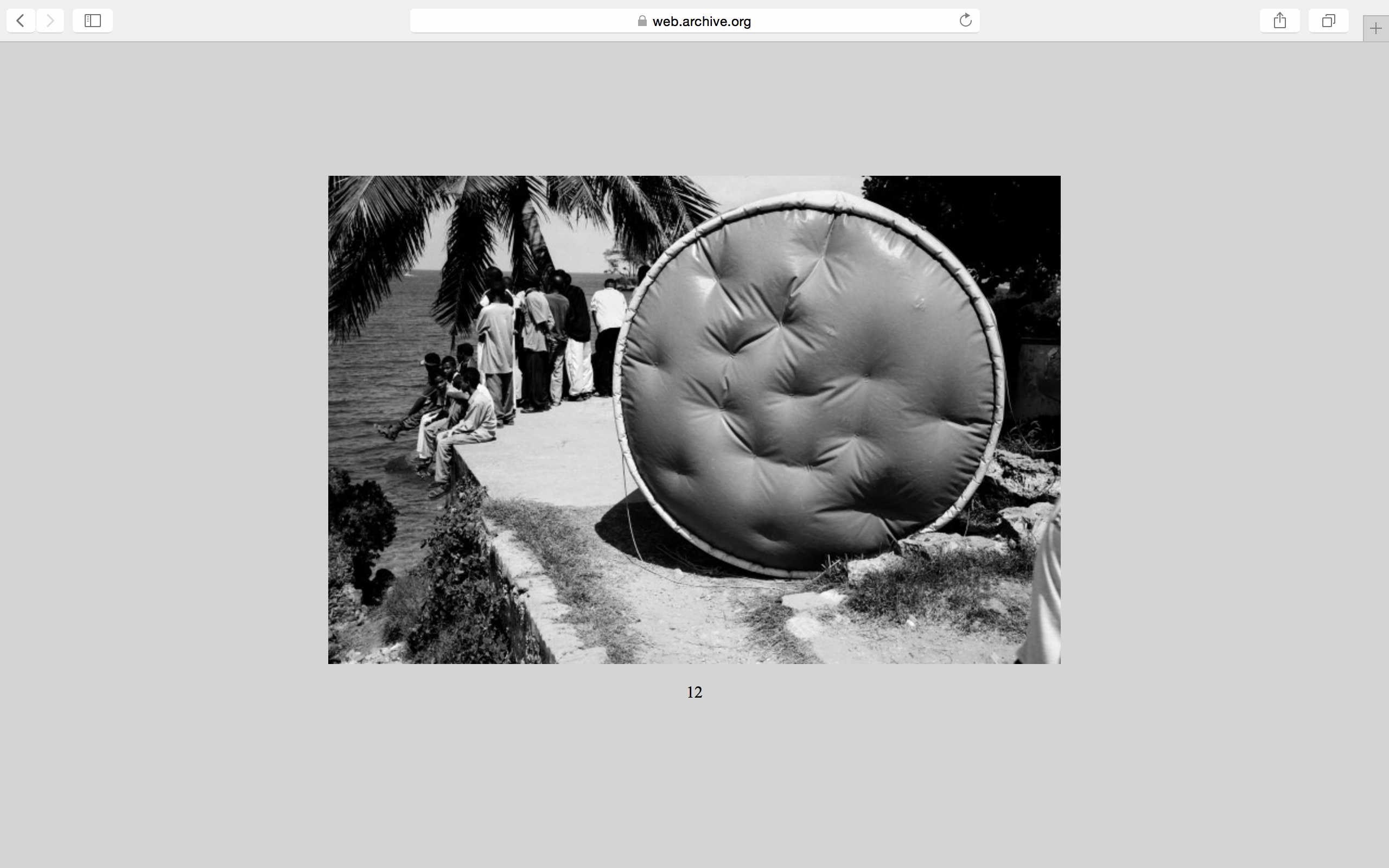
What is to come is very exciting. We haven’t appointed an editor and we haven’t appointed a producer, everyone has got an equal role. I want the project to get out and to start drifting around the college, so that other people want to get involved with it. The workshop students are also inviting others to give some work to the site, within our editorial criteria. And some of the pieces that have been invited have turned out quite nice. As I mentioned previously, one of the points on my agenda is to develop transferable cultural models. The idea is that any of the students could go and run a workshop like this. We have been talking a lot about consolidating your learning by teaching. I’d really be happy if that happened. That’s partly why I want it to continue.
