Strategy Two: Future Interactions
Interview Marc Kremers

Marc Kremers is a digital creative director based in London. His distinctive body of work is born out of an ongoing exploration into the ways the internet can be used as a medium for artistic expression and representation.
From your early experimentations to your recent projects, you seem to be always able to find a balance between a strong aesthetic statements and technological contingencies. In your opinion, which one has more importance: digital design or usability?
As I have said in a talk last year: ‘I am not a creative in the sense that I create something from a blank piece of paper. My creative ability is that I re-contextualized other people’s content’. I curate contents or frameworks from other people’s content. And I feel that’s the difference between an artist and a designer, especially in the digital realm. Maybe the work as a designer is not about creating like an artist anymore, instead maybe it’s about thinking of frameworks in which people and entities can express themselves. This is something that may also be relevant to young students thinking ahead. With user experience, you have to know the pitfalls. You learn it the hard way. When I think about some of the websites I made in the last fifteen years, especially towards the beginning, I mean: ‘what was I thinking?!’ It was so unusable. Nowadays, there is a huge focus on usability. What is interesting is that people are realising that design is the child of usability. It’s not the other way round. Design is the thing that helps it be usable. It is secondary.
Talking about social networking you mentioned that no radical changes are being made in online user experience. What does it mean?
With all this sharing and over sharing and these amazing tools that we have to make beautiful typography and designs, we can make websites that look like beautiful printed books. But it’s just become very monotone and samey. Yes, to a certain extent, we need to have some standardisation. You know that the table of content of a book is always going to be on the first pages, not at the end, not in the middle. It’s just basic stuff. Well, nowadays, we know where the menu of a website is. We got to this point and we have these amazing bases to be proud of. But now we need to be interesting again. It needs to be a bit like in the old days, when there was more experimentation, a bit more personality, a bit more punk and a bit more attitude.
Regarding the high density of datas we consume and transmit everyday, it becomes more and more difficult to envision how we will access to information. Is it possible to anticipate what standards are going to apply to digital publishing?
I was watching a lecture with Eric Schmidt from Google and he mentioned very casually: ‘either now or soon, the majority of the world will be accessing internet through mobile’. And that is so big, because I am still designing for desktop, just like most other designers. But why are we designing for the minority? We should be designing for the majority. There is a big shift and size difference, environmental differences, speed and bandwidth differences. This is what we now have to design for. And all these other technologies are going to come through. There will be more augmented reality. There will be some kind of ‘Minority Report’ sort of holograms. It all sounds a bit far fetched now, but it’s less far fetched than we realise. And then, the issue with: ‘how are we going to make this look like a book?’ is going to be irrelevant. You are going to be sitting in your lounge and thinking: ‘I really want to read this New York Times article’. So you are going to find a surface and you are going to beam the article on that surface. Of course, I am just making this up, but it’s quite a cool idea. I am looking at the right hand side of my lounge and I put my eyes there and suddenly some type beams in that area. And it has been perfectly typeset. You will be the designer of this interface that needs to figure out a new font size measurement system or unit that is about making copy legible according to the perceived distance of the text.
Has the general public become design conscious?
Creativity is a leisure concept of the future. Nowadays, I think everyone knows what Helvetica is, for instance. Everyone is using creativity. Everyone is tweaking their filters. Everyone is an amateur Photoshopper. Creativity is a cool, fun thing to do. It’s about your personal expression. It’s about your personal brand. But there is still a validity for people who are going to be leading the digital design world and having an opinion. You need to develop your own visual identity, your personal view and approach. It is a difficult thing and you could get swept up by it all. It’s important to have a strong, personal inner strength to actually navigate through it and come out of it with your own world.
And what kind of digital users have we become?
I have been thinking about this a lot in the last year, in particular by really focusing on what is easier for the user to do. I always say that ‘clicks are expensive and scrolling is cheap’. People like to scroll. They don’t really like to click. I am a very prudish clicker myself. At the same time, users have become design savvy. Take a book on Kindle. You download it and you format it to your heart’s delight. Again, the designers are still present, they are still choosing the most legible fonts and they are choosing subtle configurations and settings that come from an educated background. But the user has a power to say: ‘no, I want this in Palatino’. It is also relevant to realise that, according to Google statistics, people are on a website for a very short amount of time, for thirty seconds and, if you’re really lucky, six minutes. It makes you think: ‘how important is this for people?’ That’s crazy. And anything beyond that, they are just watching a movie anyway. The people we are designing for are so fleeting and so busy. Again it’s a design thing. You have to make sure the experience is really clear and really good.
How would you define your input into this workshop about “Future Interactions”?
Doing digital projects in a workshop environment is incredibly difficult, because five days to make anything digital is almost impossible, especially with varying skill sets in the class. But there was kind of a personal challenge for me to get something out of those five days and I also wanted to try to make it as plausible as possible. I wanted the students to learn something within this workshop that was going to be really practical. Whenever I saw some kind of opportunities, some kind of anecdote from real world experience, I would just tell them. And they loved that. I think they are yearning for both interesting, creative experiences, but also for practical, hands on information. There is a balance when you are doing digital workshops. You can go with an idea, but you also have to understand its feasibility in the real world. I wanted them to learn something within those five days that was going to be really practical. For instance, ‘no you can’t do that because of the user experience’ and ‘oh, have you thought about the band width here?’ or ‘what about older phones that don’t have gyroscopes?’ That’s a balance that I try to get right with the students and the students also try to get right.
During the workshop you asked the students to design ‘covers’ for their microsites. Can you explain where this idea comes from?
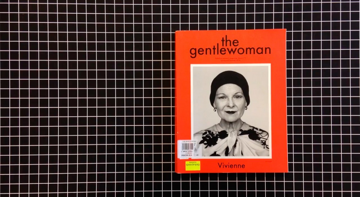
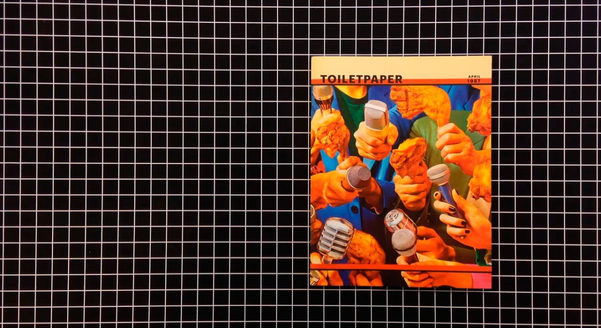
Covers are like posters and logo T-shirts. There are very few things that have that kind of sex appeal. For instance, you are at the airport and you’re looking at Apple trying to sell iPads on the back of a Times magazine. It’s always about covers. Covers are such powerful concentrated moments of contemporary culture. They have such an impact and a legacy and such a language to play with. So I thought it would be good to play with that in the context of, say, an Instagram feed, maybe animating it. It is such a perfect medium.
In 2015, how relevant is it to talk about covers? Have they not lost their power and predominance in the fragmentation of media?
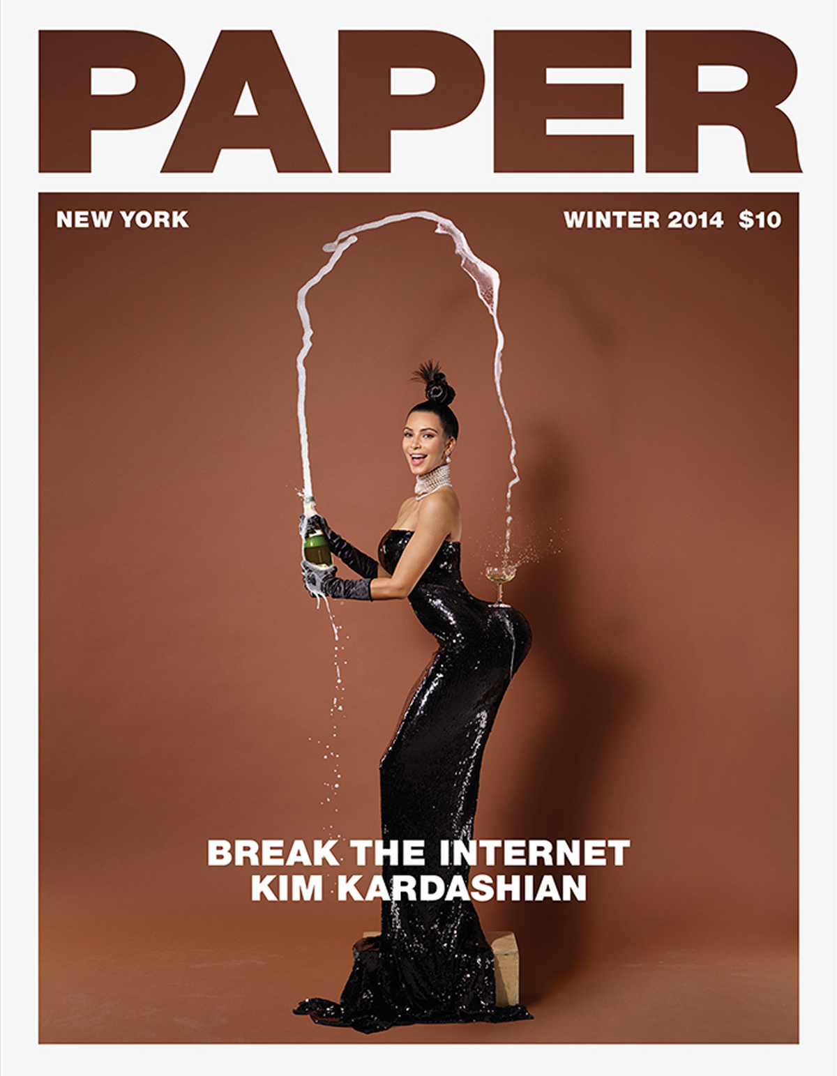
On the one hand, as a Digital Creative Director, you have to be very aware that, in a user experience and information architectural terms, people are not arriving directly on the front page. They are virtually clicking on a link they had from a Tweeter feed, for example. That’s their first experience of the site. So that’s really not going to be a cover. It’s like you walking to me and giving me a magazine on a particular page. It’s very direct. But you can totally shoot that idea down. On the other hand, the irony was that, in 2014, one of the biggest success story was the magazine cover with a naked Kim Kardashian, which literally said: ‘We’re going to break the internet’. And that was just a cover that used the power of celebrity and internet connectivity in a very, almost old-fashioned, way. If you just think about the correlations, the biggest meme was a magazine cover, but there was nothing really smart about it. They didn’t animate it. They didn’t make a gift out of it. They just scanned it and put it out there. And they sold a lot of paper magazines. Sometimes, it’s good to stand back and look at the conventional aspect of what we are doing.
How did you explore an original taxinomy of ‘covers’ for Cosmic Latte, the magazine created during the workshop?
The whole point of the cover aspect is quite literal. Instagram and Tweeter and social feeds are covers. And we just treat those as covers of a magazine. As I also just mentioned, there is a whole notion that covers don’t really apply. People are not often on the home page of a magazine site, they go to the direct link to the article. Coming back to the viability of the workshop’s outcome, we made every article in this fictitious magazine called ‘Cosmic Latte’ have its cover. So every time a new article came out, it would just have a new ‘Cosmic Latte’ cover format for that article and that would exist on the outside, in the social realm, and it would entice people to click and go straight to the article, because it was so awesome.
How do you envisage the next generation of creatives dealing with publishing?
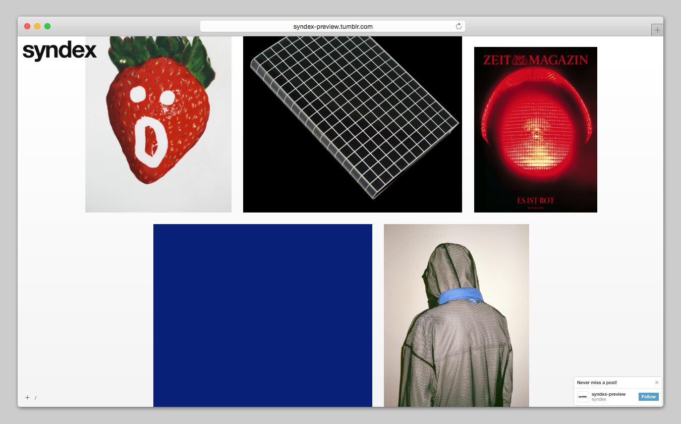
I think, just looking at the past, back in the days when the Internet started, our references were pretty much actual magazines, record covers, some flyers, hearing about stuff, maybe watching one or two fashion programmes and MTV. But it was actually quite limited. However, this generation, they have an unparallel, complete and utter aesthetic soup. A lot of young visual creatives are actually Tumblr fans, because it offers such a variety of aesthetics and ideas and curations that even they get mixed up again because they follow different things. The content of the internet varies from being ancient to being a second ago, on Instagram. Imagine if you have access to such variety at such a young age, surely you are able to come up with new paradigms. I think the new generation of creatives are going to come up with stuff that’s different. Some of the users of the Syndex theme, for example, curate images in a way that is so out there. I mean, I find each image interesting and I might save it onto my desktop. But they all mix them together, they mash them together in this kind of piecemeal, experimental way that creates a new aesthetics before your very eyes. It’s very surface, very aesthetics, very personal and very individualised.
