Strategy Two: Future Interactions
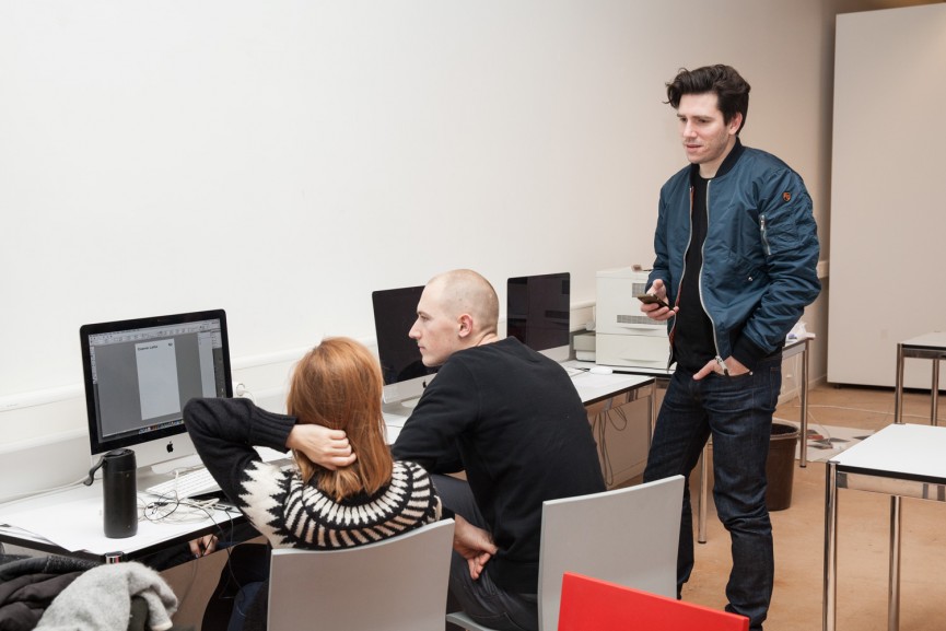
Workshop with Marc Kremers
26 – 30 Jan 2015

Marc Kremers is passionate about the Internet and its possibilities. His distinctive body of work is born out of an ongoing exploration into the ways the Internet can be used as a medium for artistic expression and representation. Since as far back as 2001 he has been experimenting with the Internet as a digital playground. He created the project Tex-Server as a repository for digital ideas and sketches outside the remit of any specific project. Another project, As Found, could be seen as the predecessor to image curation blogs such as FFFFound, and eventually Tumblr. The freedom of these early experiments matured into a deep understanding of the mechanics of user interaction and content that we see in many of his projects today.
The Brief
Intriguing differences and similarities exist between the consumption of a magazine in the real world (IRL) and online. For one, the way we first experience a magazine IRL is without fail by it’s cover, whether on the newsstand, or in the dentist’s waiting room. But online, most of us arrive on a magazine’s site via the social sphere.
Gone is the power of the magazine cover. Except, the magazine cover has never been so powerful than it is now in 2015. Two extremely disparate online phenomenons last year happened via the cover of IRL magazines: The universal cry of “Je suis Charlie”, and on a completely different universe, Paper Magazine’s Break The Internet cover with Kim Kardashian.
It’s as though the cliche of the digital medium being the death nail of print media has been reversed. In the case of Paper Magazine, it was blatantly threatening to destroy the internet itself. This was all done with deeply conventional constructs: the power of celebrity and sex, while the image is a straight remake by Jean-Paul Goude from his own archive.
So let’s be clear, there was no innovation, only highly seductive sensationalism. The layer of innovation involved with this occurred outside the constructs of this magazines publishing strategies (the invention of the internet, Twitter, Facebook and so on). And yet, the Break the Internet cover feels contemporary and fresh. A true contradiction. This can be explained by the participatory power of the internet. All Paper had to do was make a conventional magazine cover. They let the Internet, and the millions of Twitter users and photoshop amateurs do the rest.
It would be interesting to know how many people read the article compared to how many people saw the cover. These trends in contemporary publishing strategies have to be considered in a workshop like this.
The cover and the cover story
Based on the observations above, i’d like you to explore new digital formations of the cover and the cover story.
The Genre Defining part — Wikizine. As much as I have admitted to content being king, we will not be focussing on content creation in this workshop as this is not my remit as a designer, we want to focus on user interaction and experience this week. So, imagine that you are both the editor and art director of a magazine that curated articles from Wikipedia, perhaps with an overarching discourse (politics, philosophy, culture) or perhaps more generalist with themed issues (pop, art, design). Choose one article from Wikipedia that will be the cover, and the cover story of this month’s issue of Wikizine (This is a working title, happy for you to rename it).
The Art Direction part — Editorialise the Article as a microsite. This is your chance to consider interesting ways to make the article come to life. Or not. In fact, your opinion here as an art director as well as content editor comes into play. If you’ve chosen to design an article on the typeface Garamond, you may wish to do something restrained, highly legible, scholarly. If you’ve chosen the wikipedia article on Dada, it may be something literally Dada-esque, with the body copy typeface set to Zapf dingbats. Maybe you choose the wikipedia article Censorship, imagine the possibilities there.
The Publishing Strategy part — Create a outward and inward cover. Consider classic so called feature or cover articles such as the New York Time’s “Snow Fall – The Avalanche at Tunnel Creek” or Pitchfork’s “Cover Story: Daft Punk”. Each of these utilise a cover image above the fold of the browser. For this workshop I’d like you to design a “cover” for the article page itself, but create it in a way that it can also easily be repackaged on social channels like Tumblr (GIF), Twitter and Instagram (Vine loops and 15 second movie clips). This needs to be demonstrated in at least one channel, perhaps even your own feed or feeds. I’m imagining as a workshop result: a page with all the covers in a grid, and being able to click on each one to see the article, could look really good. It’s important to note that the NYT/Pitchfork references above, being microsites, are both free from the normal requirements of side panels with other site content. Personally I think this is a mistake. We want this cover story to intelligently lead the user to other parts of the site.
The Reality — We need to acknowledge the modes of consumption and the plethora of scenarios we as digital designers have to cater for. Is the reader of this article waiting at the bus stop, or lying down on her couch with an iPad, or eating a sandwich with one had while clicking links via twitter on the other on his rushed lunch break? Some people don’t even read the article you’ve designed in it’s original form, using Flipboard, Instapaper, or Safari’s “Reader View”. We recently released The Green Soccer Journal’s new site. The stats say that 70% of readers are on their mobile, and only 15% on desktop.
For this workshop, you are able to choose the device with which your cover story is accessed, but keep these facts in mind when making that decision. The article you choose to work on for this workshop could in fact be enhanced by the medium it’s on. For example, maybe you choose to do a cover story on walking, and the only way yo can scroll the page is by walking with your mobile?
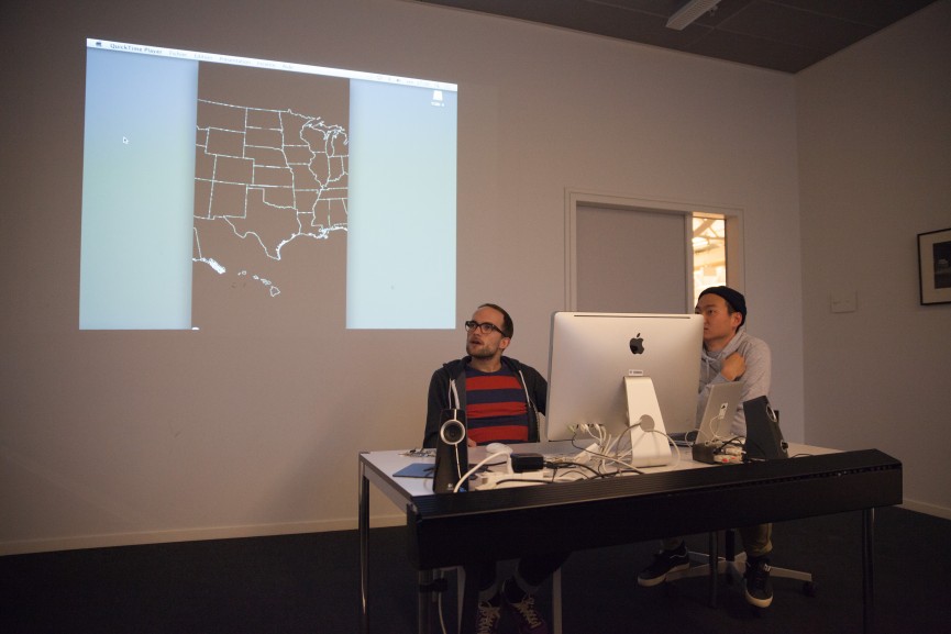
Marc Kremers
25 January 2015
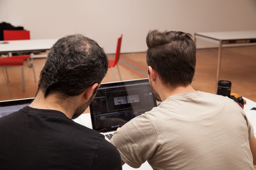
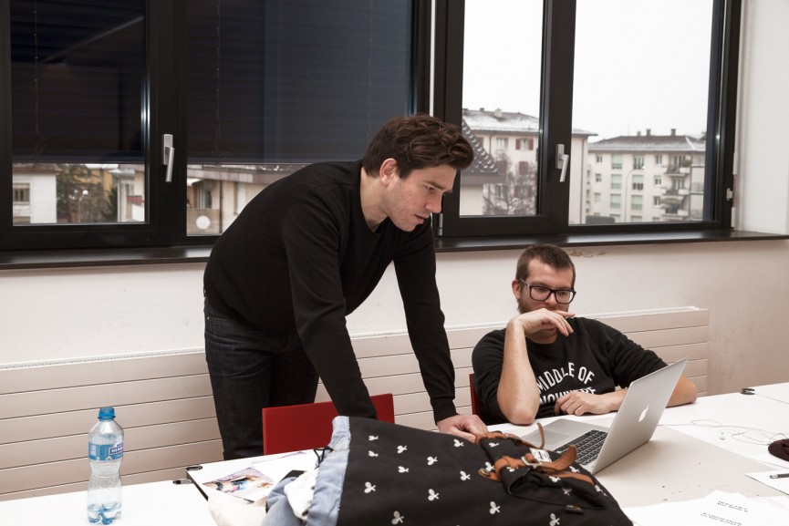
Workshop Outcome
Cosmic Latte #1
Simon Mager, Charlotte Marcodini, Nicolas Polli
Cosmic Latte is an online magazine that curates monthly Wikipedia picks. This first issue features Lunar Milk, an article about sexual practices in space. Sex in space is human sexual activity in the weightlessness and/or extreme environments of outer space. Sexual activity and procreation distinguished by the state of weightlessness (precluding artificial gravity) presents difficulties surrounding the performance of most sexual activities due to Newton’s third law. The issue also includes conception and pregnancy in off-Earth environments.
Cosmic Latte #2
Ana Cuba, Jagoda Wisniewska
Our starting point was an article about the ouija board. We wondered how we could enhance the concept of the ouija board with interactive elements. We created a platform that enables users to share a question and get answers from an online community in real time.
Cosmic Latte #3
Tobias Holzmann, Heejae Yang
The article on Timothy Michael Samaras, American storm chaser who died in 2013, tries to link documentary journalism and responsive design. Taking the Wikipedia page on Samaras as a starting point, the idea is to scroll down through the different parts of the article. Each chapter (or headline) is marked by a different interactive effect: images are animated to illustrate natural phenomena and the text disappears in a way that reflects its content. Instructions are given to those effects that need more than just a finger swiping over the screen. Due to the large number of interactive elements, the design is kept quite simple, using only black body text typography on a white background.
Cosmic Latte #4
Ricardo Ferrol, Johannes Bauer
We have chosen the article about the Apple M7 processor. We designed a microsite that demonstrates the geopositioning and gyroscopic possibilities of the processor. Through a series of interactive features, we aimed to reveal each specific feature of the M7.
Cosmic Latte #5
Sabina Bösch, Christelle Boulé
Our microsite uses the Wikipedia article on Misophonia, which is described as the hatred of sound—when specific sounds trigger negative emotions. We created a website that presents users with short video clips of actions and their corresponding sounds. The user is asked to give their emotional response to the sound, from anger to indifference.

