Digital Primer

Workshop with MAAD

01 – 04 Oct 2014

The aim of this three day workshop was to introduce prototyping methods, without doing any programming. Each student was given a genre-defining magazine and a random object, and asked to create a microsite combining the two. These arbitrary associations compelled each group to be innovative while merging banal objects with strong editorial identities. Tools such as After Effects, InDesign and stop motion with Acrobat, were used to animate and demonstrate the concept and functionality of each microsite.

Outcome

Leonardo Azzolini, Sylvain Esposito, Charlotte Marcodini
Fantastic Man + Chair

Our proposal for a microsite for Fantastic Man reflects on the lack of purely editorial and web-based content and insists on the need for a more interactive and richer digital experience. In order to involve the user in the website, we became an editorial team that focused firstly on art direction in order to produce content that shares Fantastic Man’s values and language. For this reason it was fundamental to carefully scout the model and style the shoot so as to be as close as possible to the source. Secondly, we designed the platform in a way that does not shock the user as he or she enters the microsite while at the same time making it relevant as a parallel location.

Conceptually, the proposed editorial format is entitled “The Fantastic Three”: a weekly presentation of personalities through their collection of favourite objects, limited to three per person. The microsite has a vertical structure composed of three sections: kicking off with a textual presentation of the weekly choice, moving on to a presentation of the three actual objects and concluding with biographical notes about the featured collector. The metaphor of the podium is employed to support the simple storytelling, so the user goes through all three stages with in-between images of stacking objects, in a background layer, representing the progress. With texts and images, each stage presents the object as it is and its in-use relation with the owner, who is framed in a domestic environment that includes information about his or her lifestyle and taste. Those horizontal intersections represent a sub-layer in the main vertical narration, enriching the navigation and providing a unified portrait of human and object.

The microsite functions as a quick insight into a specific aspect of the life of the featured personality and could at the same time be used as a platform with commercial purposes. On the main website it is accessible by clicking on an animated gif that includes the title and visually refers to the in-between images of stacking objects in order to stress the nature of the weekly selection. No archive for the selections is provided. In conclusion, our effort was mainly to create a platform for high quality visual content to be enjoyed in. a fresh and interactive way, without forgetting the stance of Fantastic Man’s writing and editorial voice.

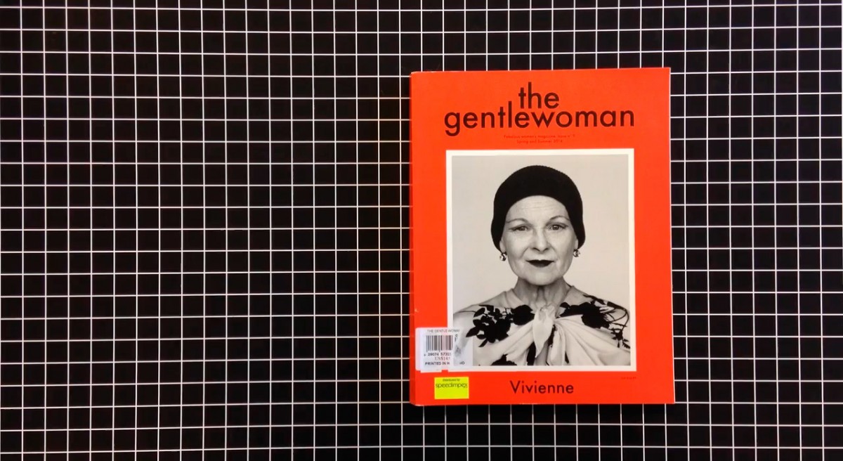
Maria Trofimova, Sabina Vera Bösch, Kim Andenmatten
Gentlewoman + Water Bottle

We chose to create a smartphone app for Gentlewoman that is based on their existing design and content. The idea was to offer an aspect of the content of the magazine that is about lifestyle and recommendations of what to buy, where to go, etc. in a digital form that would rely on all the technical possibilities of the smartphone for creating interactivity and experience. A smartphone is a personal object most of us have an intimate relationship with. We refer to it to guide us in our everyday lives: in the city, in our schedules, etc.

Shake Me Gently is a tool that will allow users to be inspired in their daily routine, add spirituality and create better living by providing them with a list of instructions for their day, in the form of little exercises, advice for places to go, artworks to see, products to chose, etc. The inspiration for the app is water, historically an element that is linked to divination and oracles. The user shakes her phone and the app analyzes the way of shaking, the geolocation, and data such as weather, interests, other apps, etc. A colour is generated that symbolizes the mood of the day. According to all of these settings, the list of instructions is created.

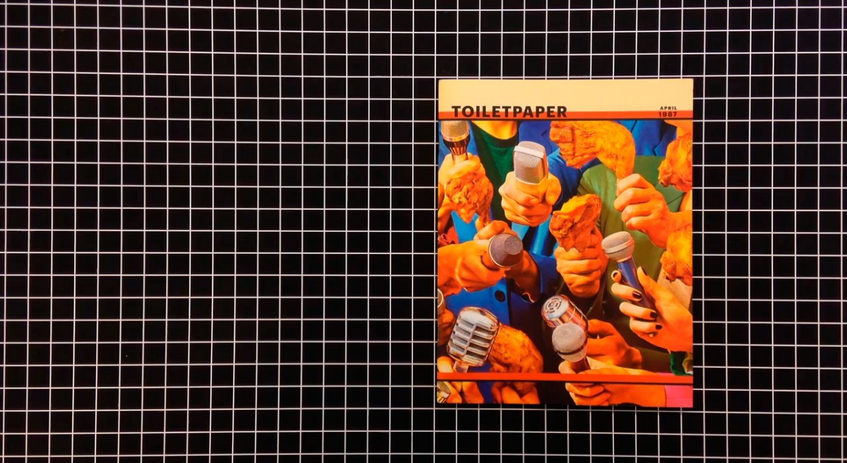
Simon Mager, Jessica Mantel, Dmitry Bukreev
Toiletpaper Magazine + Record Player

TurnTube is a digital reinterpretation of the record player. Inspired by the recent revival in vinyl records, it is a light-hearted device for the contemporary crate digger. The microsite serves as a turning plate/record player by using Youtube videos as a source of music. You can click trough a constantly changing playlist that is curated by the editors of TurnTube: 15 videos especially selected for Toiletpaper Magazine. Users can also choose their own records by simply pasting a YouTube URL in the provided field. The trackpad can be used to speed up, stop and rewind the video.

The design of our mircosite mainly takes inspiration from the fun and crude design of the Toiletpaper Magazine website. We wanted it to fit seamlessly with the main website, with only the yellow border setting it apart.

Ricardo Ferrol, Maria Guta, Eric Loizzo
Butt + Running Shoes

One of the features that grabbed our attention on BUTT’s website, is the chat rooms for registered users. As the magazine is strongly rooted in a community ethos, we wanted to create a platform where the users could instantly feel a part of a larger body. The microsite serves as a platform for taking part in virtual workout classes. The instructor is shown in a video in real time and the users can login and turn on their own webcam and follow along. Their video stream will be shown along with the other participants, creating a virtual exercise group. The most dedicated users would get a free American Apparel shirt with a custom design.

The design of the microsite has a quite kitsch feel drawing inspiration from a 1980s aesthetic. This also encourages users to dress up in appropriately outlandish attire. To unify the video streams they are converted to black and white, with a pink overlay to match BUTT’s house style.

Christelle Boulé, Namsa Leuba, Larissa Kasper
Pitchwork + Bread

Fresh Bread is conceived as a humorous take on “curated” playlists. Our idea is that a new track is available for viewing in the morning, only between for a certain time period, say 8—10 am. Users have to visit the site during this time to hear the track. Guest artists are invited to create the video clips for each new song for one week. At the end of the week all the tracks are displayed as an intervention on the homepage.

Johannes Bauer, Kyoungtae Kim, Heejae Yang
Pin Up Magazine + Smartphone

PARTICLE explores new ways of experiencing architecture using a smartphone. For this microsite we decided to look at the ECAL building. Particularities and features of the architecture were documented using smartphone apps, which can make three-dimensional rendered data from lots of photographs. The resulting images are often broken and incomplete, which creates new and fictional spaces, which is what one finds on this microsite. Some images can be controlled by changing the point of view, or by scrolling, which gives the user a new way of experiencing the existing environments.

Anna Cuba, Jana Neff, Jagoda Wisniewska
032c + Flower

The Horror of Tulips is a reinterpretation of a text by Slavoj Žižek. The user is asked for their age, and is then shown only philosophically (not explicit) sexual content. The user searches around the screen, being shown images metaphorically related to sexual arousal. They only have a certain amount of time, which is shown on the “plant-meter” at the top right. When the time is up they are taken to an article by Žižek, which explains some of ideas behind the images.

Nicolas Polli, Michaël Teixeira
Apartamento Magazine + Food

Yum Yum Projects is a collaboration between an illustrator and a magazine. It ia an Apartamento Magazine web supplement intended for children, mocked up on an iPad because it makes use of the swipe feature. Users are invited to compose new characters through the method of the “cadavre exquis”, which they can then print out and use as a colouring template.

Latest Resources

✂ Copy and ? Paste Emoji ?
getemoji.com

No apps required.

Computer Virus Catalog
computerviruscatalog.com

They steal our files, corrupt our hard drives and destroy our lives. We scan. We block. Do everything we can to prevent infection. Computer viruses. We hate ’em. Nevertheless, we remain fascinated by their evil plots. This fascination led to a new kind of art collection – Computer Virus Catalog. The worst viruses in computer history interpreted by artists around the world.

Founded & curated by Bas van de Poel

Scrolling on the web: A primer
blogs.windows.com

Scrolling is one of the oldest interactions on the web. Long before we had pull-to-refresh or infinite-loading lists, the humble scrollbar solved the web’s original scaling problem: how can we interact with content that’s stretched beyond the available viewport?

Resilient web design
resilientwebdesign.com

Resilient Web Design, you might think that this is a handbook for designing robust websites. This is not a handbook. It’s more like a history book.

A Handmade Web
luckysoap.com

‘handmade web’ to refer to web pages coded by hand rather than by software…

Eloquent JavaScript
eloquentjavascript.net

This is a book about JavaScript, programming, and the wonders of the digital.

The Future of Browser History
medium.freecodecamp.com

About browsers history, and how we tend to browse nowadays.

Swiss in CSS
swissincss.com

Swiss in CSS is a homage to the International Typographic Style and the designers that pioneered the ideas behind the influential design movement.

Automatically art-directed responsive images
cloudinary.com

by Eric Portis

WHAT IS CODE?
bloomberg.com

Businessweek, June 11, 2015
by Paul Ford

Interview with Tom Krcha, Adobe XD
subtraction.com

Adobe released the first public preview of what the company is now calling Adobe XD, its their major new UX/UI design and prototyping tool.

Typography for User Interfaces
viljamis.com

A recap of how far type in UI has come, where it’s going (VR) and what to look for when choosing a workhorse for your next interface. (via Atomic.io)

Typeface As Programme: Glossary
typotheque.com

A glossary of tools and technologies mentioned in Typeface As Programme.
by Jürg Lehni

Declarative Design Tools
jon.gold

Our brains and computers are fast; our hands, mice and keyboards are slow.

Roger That: Emoji Overdrive
ia.net

A font that turns the 2,000 most used English words into emoji.

Layout in Flipboard
engineering.flipboard.com

Flipboard Pages, a layout engine that turns web page articles into magazine pages for the iPad.

Use Your Interface
uyi.io

UYI, is a place documenting the uprising of motion based interface patterns.

Google Fonts
fonts.google.com

Google’s new site for Web fonts.


New Yorker cover comes to life
itsnicethat.com

Malika Favre’s illustration for this week’s New Yorker magazine has been brought to life by French animator Mathieu Maillefer.

Natural User Interface

In computing, a Natural User Interface (NUI) is the common parlance used by designers and developers of human-machine interfaces to refer to a user interface that is effectively invisible, and remains invisible as the user continuously learns increasingly complex interactions. The word natural is used because most computer interfaces use artificial control devices whose operation has to be learned.

Graphical user interface

In computing, a graphical user interface (GUI, sometimes pronounced “gooey” or “gee-you-eye”) is a type of interface that allows users to interact with electronic devices through graphical icons and visual indicators such as secondary notation, as opposed to text-based interfaces, typed command labels or text navigation. GUIs were introduced in reaction to the perceived steep learning curve of command-line interfaces (CLIs), which require commands to be typed on the keyboard.

Parallax scrolling

Parallax scrolling is a special scrolling technique in computer graphics, wherein background images move by the camera slower than foreground images, creating an illusion of depth in a 2D video game and adding to the immersion.
Web designers began incorporating parallax scrolling in 2011, using HTML5 and CSS3. Websites with parallax backgrounds are becoming an increasingly popular strategy, as advocates argue it is a simple way to embrace the fluidity of the Web.

WebGL

A Web Graphics Library (WebGL) is a JavaScript API for rendering interactive 3D computer graphics and 2D graphics within any compatible web browser without the use of plug-ins. WebGL is integrated completely into all the web standards of the browser allowing GPU accelerated usage of physics and image processing and effects as part of the web page canvas. WebGL elements can be mixed with other HTML elements and composited with other parts of the page or page background.

Twitterbot

A Twitterbot is a program used to produce automated posts on the Twitter microblogging service, or to automatically follow Twitter users. Twitterbots come in various forms. For example, many serve as spam, enticing clicks on promotional links. Others post @replies or automatically “retweet” in response to tweets that include a certain word or phrase. These automatic tweets are often seen as fun or silly. Some Twitter users even program Twitterbots to assist themselves with scheduling or reminders.

UEM

User experience moment.

Usability

Usability refers to how easy it is for a visitor to your site to use your site in its intended manner. In other words, are navigation, content, images, and any interactive elements easy to use, functioning the way they were intended, and that your intended target visitor will not need any special training in order to use your site.

Permalink

Short for “permanent link.” Generally used only on blogs, a permalink is a link that is the permanent web address of a given blog post. Since most blogs have constantly-changing content, the permalink offers a way for readers to bookmark or link to specific posts even after those posts have moved off the home page or primary category page.

Pageview

A pageview is a request for an entire web page document from a server by a visitor’s browser. In other words, for each page view your site had, someone (or a search engine spider) looked at that page.

Meta data

Meta data is the data contained in the header that offers information about the web page that a visitor is currently on. The information contained in the meta data isn’t viewable on the web page (except in the source code). Meta data is contained within meta tags.

Hypertext

Hypertext is any computer-based text that includes hyperlinks. Hypertext can also include presentation devices like tables or images, in addition to plain text and links.

Hyperlink

A hyperlink is a link from one web page to another, either on the same site or another one. Generally these are text or images, and are highlighted in some way (text is often underlined or put in a different color or font weight). The inclusion of hyperlinks are the “hyper” part of “hypertext.”

Hit

Contrary to popular belief, a hit does not represent a single visitor to a website. A hit is actually a request for a single file from your web server. This means one page can actually generate multiple hits, as each page generally has more than one file (an html or other base file, a css file, multiple images, etc.) and each one is requested from the server whenever the page is loaded. Some marketing people like to quote hits to unknowing consumers as the number makes their site sound like it’s getting a whole lot more traffic than it actually is.

Focal Point

The focal point of a web site is the spot on a web page that they eye is naturally drawn to. This could be an image, a banner, text, Flash content, or just about anything else. You want to make sure that whatever is acting as your focal point is the most important part of your site.

Fixed Width Layout

A fixed width layout has a set width (generally defined in pixels) set by the designer. The width stays the same regardless of screen resolution, monitor size, or browser window size. It allows for minute adjustments to be made to a design that will stay consistent across browsers. Designers have more control over exactly how a site will appear across platforms with this type of layout.

Elastic Layout

An elastic layout is one that uses percentages and ems for widths paired with a max-width style to allow the site layout to stretch when font sizes are changed. It’s ability to flex to accommodate the browser width and reader’s font preferences are where it gets its name.

Cascading Style Sheets

Also referred to simply as CSS, Cascading Style Sheets are used to define the look and feel of a web site outside of the actual HTML file(s) of the site. In recent years, CSS has replaced tables and other HTML-based methods for formatting and laying out websites. The benefits to using CSS are many, but some of the most important are the simplification of a site’s HTML files (which can actually increase search engine rankings) and the ability to completely change the style of a site by changing just one file, without having to make changes to content.

Cache/chaching

Cached files are those that are saved or copied (downloaded) by a web browser so that the next time that user visits the site, the page loads faster.

Bounce rate

A website’s bounce rate is the percentage of people who leave the site from the same page they entered the site, without clicking through to any other pages. This can be a good indicator of how good a website’s navigation is, as well as an indicator of the quality of the site’s content (a very high bounce rate doesn’t bode well for either of those things).

AJAX

Stands for Asynchronous JavaScript and XML. AJAX is typically used for creating dynamic web applications and allows for asynchronous data retrieval without having to reload the page a visitor is on. The JavaScript on a given page handles most of the basic functions of the application, making it perform more like a desktop program instead of a web-based one.