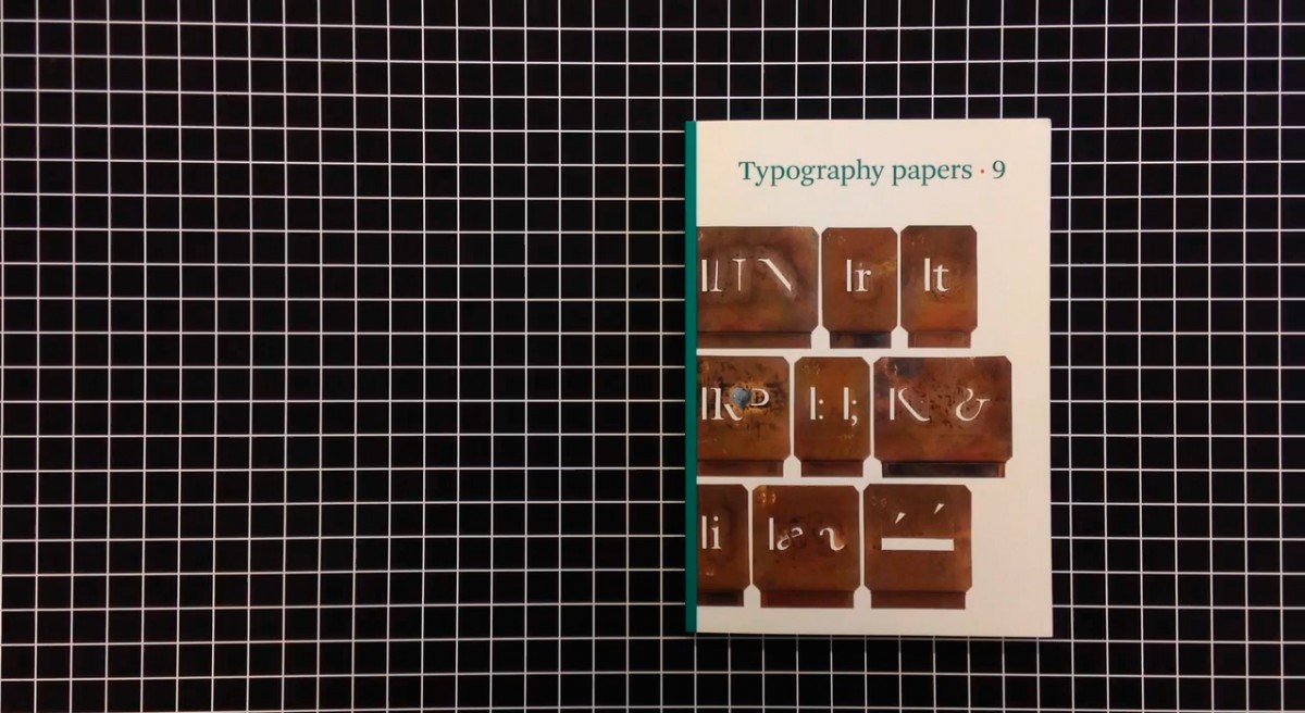
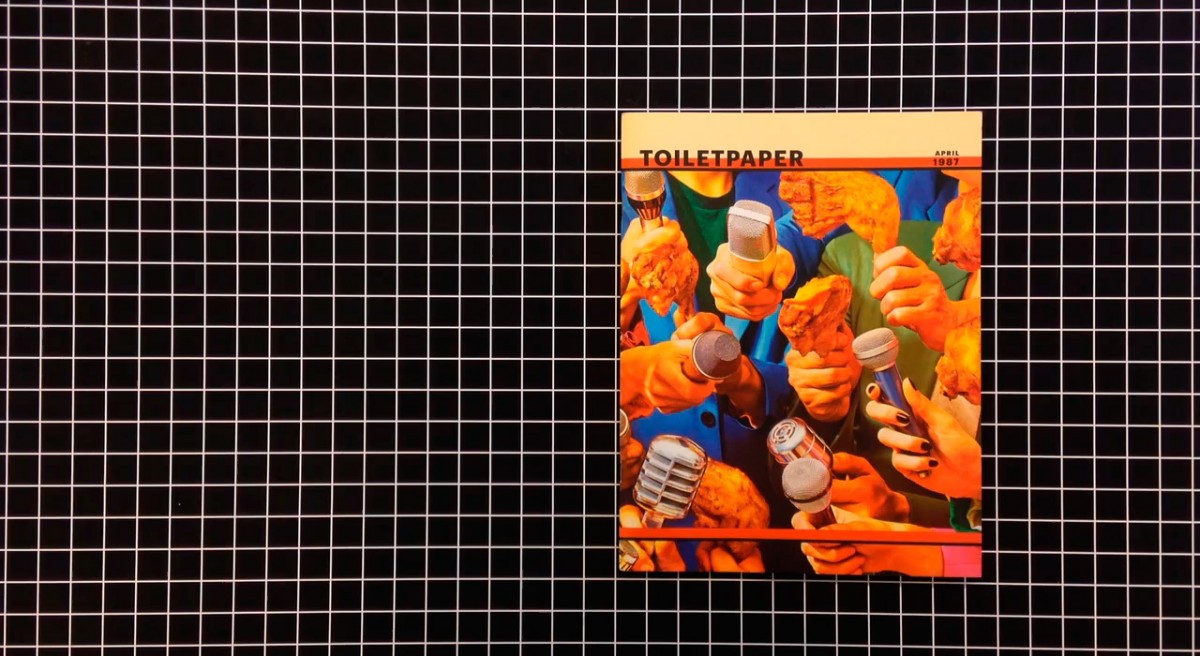
Over the Bridge
Rob Giampietro

28 Mar 2017

The bridge is a threshold, and you encounter it in a time of change. Changing geographies. Changing politics. A bridge marks the place where there is a cleft, a divide. A split the bridge has been built to mend. A bridge sometimes marks the wish of reconstitution, and always the need for transversal. Like the wheel or the law, the bridge is technology.

Before there was analog and digital, there was just the world that was the case. We were unaware of the dichotomy before, but now a new territory has appeared. We formulated it. The arrow of time is a bridge from one day to the next. Time’s bridge has no way back. Some bridges have a heavy toll in one direction, others do not. This may be a feature of bridges. As we cross a bridge, we may wonder if we weren’t better off staying on the side we’ve just left.

Page-turning effect in Ibook

Metaphors are bridges made of language. The word “metaphor” comes from “carry over, across.” You can see the bridge in the word itself. Metaphors formulate at threshold moments. On one side is a dream, a speculation. On the other side is reality, the everyday. The metaphor places the dream in terms of practical language so we can talk about it collectively, but it’s only a phase. We might talk about a metaphor so often that it becomes a new word, the metaphor falls away. The word “metaphor” is like this. That it’s a metaphor itself has become almost invisible.

Google Self-Driving Prototype 1

Below the bridge there is a gap. The bridge covers it. Invisibility and technology have a close relationship. Before the car there was the carriage, and then the horseless carriage, and then the automobile. The driverless car, the self-driving car, the autonomous car, then, finally, just the car again. The magazine, the digital magazine. What’s new matters most while it’s new. That the best technology is invisible is something many technologists have observed — Wired’s Kevin Kelly, Twitter’s Jack Dorsey. Don Norman wrote a book, The Invisible Computer. What’s behind this? Having put it in the world, we want to remove it again, but leave its functionality in place. Technology mediates our social relations, less of it, some say, would make us more social. We could directly manipulate our environment.
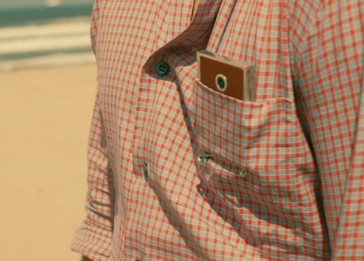
The interface is the gap between the user and the technology — the design of interfaces is to bring them closer and closer to the user’s own body, to clothe the user. The user faces the technology and the technology faces the user. The interface is the space between them. There’s a mouse, there’s a stylus, there’s a finger, there’s the voice, there’s the retina itself. Technology as extension rather than appendage. Closer and closer, woven together, more and more invisible. Clothes are technology. Food is technology. How would we live without it.
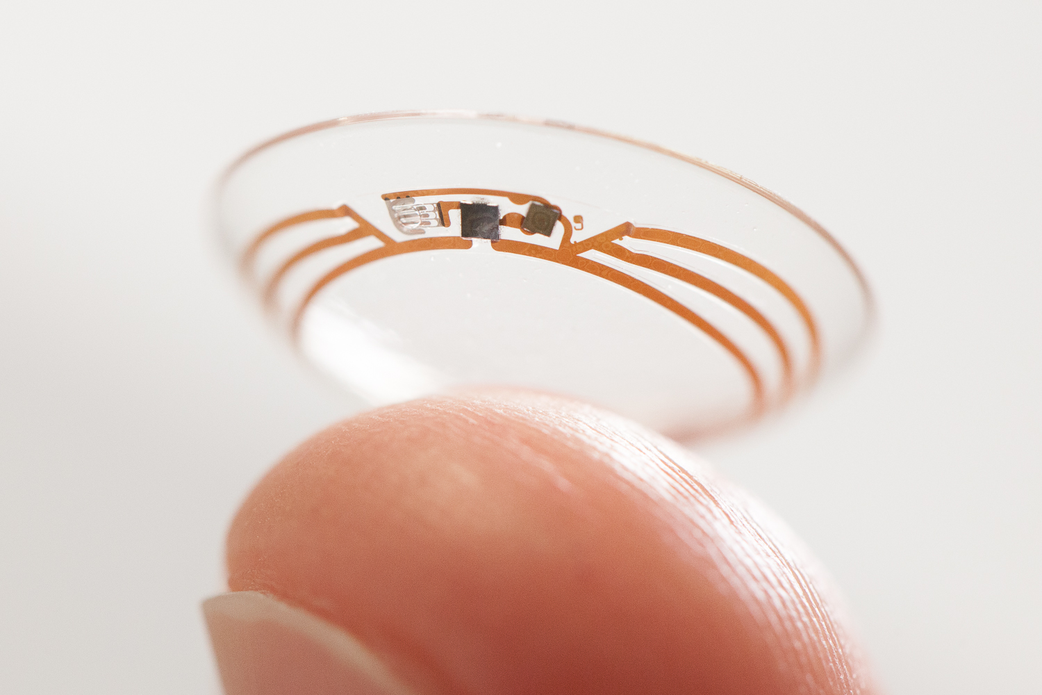
Smart contact lenses with a built-in camera.
Photoshop background eraser example

We need to recognize the old in the new. Everyone understands light and weight. The sun high above, a shadow on the ground. It needs no translation. Light is a bridge. Push something away, it resists you. Weight is a bridge. We put the physics of our physical spaces into our virtual ones. We render dimension until we accept the screen’s essentially flat materiality, in all its projected layers. Great architecture can soar and shelter at the same time. When we remake the world, we put new impossibility, new paradox, new magic into it. The Photoshop eraser wipes the canvas clean. No rubbing, no residue. Even the canvas itself may be transparent, invisible, a blinking marquee made with electronic pulses reminds you what’s been removed. In a moment, it’s gone, its trace layered in your History palette.

Content aware layout diagram

The bridge speeds the route. Instead of going around you can go through. Sometimes it’s faster because it’s faster. Sometimes it’s faster because it’s less boring, because some other meaningful task may be done instead. The mind may be put to better use. The component is born. The readymade. Perhaps the component is intelligent or aware of itself. Below a certain size, it must vanish altogether. It must always be centered. Its body copy must never be less than 50% the size of its headline. One one side, fixity, certainty, persistence. On the other, flexibility, awareness, variation. The component forms a cellular intelligence for the platform on which the documents are placed. Rules accrue. A networked logic emerges. The system, if well made, can solve its own problems. The more variation you want, the more solving there may be to do.

Bridges expand territory. The bridge changes the world and the edge at once. The world is bigger and the edge is gone, it’s now just a landmark. When a page is fixed its imagery is intrinsic. When it’s variable its imagery is a feature. Its variations and dimensions potentially infinite. Behaviors become parameters. Algorithms recognize features of an image and know how to crop it. Past the Buddhist’s world of Ten Thousand Things, past the Renaissance frescoes that show the cosmos on the ceilings of churches and chapels, past Escher’s folded planes and Mandelbrot’s zooming fractals, bigness has lost all bounds. The newspaper arrives with a VR headset. The virtual image expands by size and by number, rendering and realizing itself based on the site of its display. And as designers we must decide what exists when nothing exists for the image we’ve ordered to appear.

Whole Earth Truck Store

But things that have gone one way may come back by a different route. The information superhighway becomes simply the internet, and the world, later, finds itself called an internet of things. We hear friends describing a painting as a social network, city infrastructure as an operating system, a weather report as a conversation. We’ve carried our ideas back over the bridge. We’re describing an old reality in terms of a new one. Magazines allow communities to look in a particular way, to talk about particular things, to feel connected not through wires or wifi but through attitudes and leanings and fidelities of a more aesthetic sort. Magazines will certainly continue past the threshold. Look out for them.
Latest Resources

✂ Copy and ? Paste Emoji ?
getemoji.com

No apps required.

Computer Virus Catalog
computerviruscatalog.com

They steal our files, corrupt our hard drives and destroy our lives. We scan. We block. Do everything we can to prevent infection. Computer viruses. We hate ’em. Nevertheless, we remain fascinated by their evil plots. This fascination led to a new kind of art collection – Computer Virus Catalog. The worst viruses in computer history interpreted by artists around the world.

Founded & curated by Bas van de Poel

Scrolling on the web: A primer
blogs.windows.com

Scrolling is one of the oldest interactions on the web. Long before we had pull-to-refresh or infinite-loading lists, the humble scrollbar solved the web’s original scaling problem: how can we interact with content that’s stretched beyond the available viewport?

Resilient web design
resilientwebdesign.com

Resilient Web Design, you might think that this is a handbook for designing robust websites. This is not a handbook. It’s more like a history book.

A Handmade Web
luckysoap.com

‘handmade web’ to refer to web pages coded by hand rather than by software…

Eloquent JavaScript
eloquentjavascript.net

This is a book about JavaScript, programming, and the wonders of the digital.

The Future of Browser History
medium.freecodecamp.com

About browsers history, and how we tend to browse nowadays.

Swiss in CSS
swissincss.com

Swiss in CSS is a homage to the International Typographic Style and the designers that pioneered the ideas behind the influential design movement.

Automatically art-directed responsive images
cloudinary.com

by Eric Portis

WHAT IS CODE?
bloomberg.com

Businessweek, June 11, 2015
by Paul Ford

Interview with Tom Krcha, Adobe XD
subtraction.com

Adobe released the first public preview of what the company is now calling Adobe XD, its their major new UX/UI design and prototyping tool.

Typography for User Interfaces
viljamis.com

A recap of how far type in UI has come, where it’s going (VR) and what to look for when choosing a workhorse for your next interface. (via Atomic.io)

Typeface As Programme: Glossary
typotheque.com

A glossary of tools and technologies mentioned in Typeface As Programme.
by Jürg Lehni

Declarative Design Tools
jon.gold

Our brains and computers are fast; our hands, mice and keyboards are slow.

Roger That: Emoji Overdrive
ia.net

A font that turns the 2,000 most used English words into emoji.

Layout in Flipboard
engineering.flipboard.com

Flipboard Pages, a layout engine that turns web page articles into magazine pages for the iPad.

Use Your Interface
uyi.io

UYI, is a place documenting the uprising of motion based interface patterns.

Google Fonts
fonts.google.com

Google’s new site for Web fonts.


New Yorker cover comes to life
itsnicethat.com

Malika Favre’s illustration for this week’s New Yorker magazine has been brought to life by French animator Mathieu Maillefer.

Natural User Interface

In computing, a Natural User Interface (NUI) is the common parlance used by designers and developers of human-machine interfaces to refer to a user interface that is effectively invisible, and remains invisible as the user continuously learns increasingly complex interactions. The word natural is used because most computer interfaces use artificial control devices whose operation has to be learned.

Graphical user interface

In computing, a graphical user interface (GUI, sometimes pronounced “gooey” or “gee-you-eye”) is a type of interface that allows users to interact with electronic devices through graphical icons and visual indicators such as secondary notation, as opposed to text-based interfaces, typed command labels or text navigation. GUIs were introduced in reaction to the perceived steep learning curve of command-line interfaces (CLIs), which require commands to be typed on the keyboard.

Parallax scrolling

Parallax scrolling is a special scrolling technique in computer graphics, wherein background images move by the camera slower than foreground images, creating an illusion of depth in a 2D video game and adding to the immersion.
Web designers began incorporating parallax scrolling in 2011, using HTML5 and CSS3. Websites with parallax backgrounds are becoming an increasingly popular strategy, as advocates argue it is a simple way to embrace the fluidity of the Web.

WebGL

A Web Graphics Library (WebGL) is a JavaScript API for rendering interactive 3D computer graphics and 2D graphics within any compatible web browser without the use of plug-ins. WebGL is integrated completely into all the web standards of the browser allowing GPU accelerated usage of physics and image processing and effects as part of the web page canvas. WebGL elements can be mixed with other HTML elements and composited with other parts of the page or page background.

Twitterbot

A Twitterbot is a program used to produce automated posts on the Twitter microblogging service, or to automatically follow Twitter users. Twitterbots come in various forms. For example, many serve as spam, enticing clicks on promotional links. Others post @replies or automatically “retweet” in response to tweets that include a certain word or phrase. These automatic tweets are often seen as fun or silly. Some Twitter users even program Twitterbots to assist themselves with scheduling or reminders.

UEM

User experience moment.

Usability

Usability refers to how easy it is for a visitor to your site to use your site in its intended manner. In other words, are navigation, content, images, and any interactive elements easy to use, functioning the way they were intended, and that your intended target visitor will not need any special training in order to use your site.

Permalink

Short for “permanent link.” Generally used only on blogs, a permalink is a link that is the permanent web address of a given blog post. Since most blogs have constantly-changing content, the permalink offers a way for readers to bookmark or link to specific posts even after those posts have moved off the home page or primary category page.

Pageview

A pageview is a request for an entire web page document from a server by a visitor’s browser. In other words, for each page view your site had, someone (or a search engine spider) looked at that page.

Meta data

Meta data is the data contained in the header that offers information about the web page that a visitor is currently on. The information contained in the meta data isn’t viewable on the web page (except in the source code). Meta data is contained within meta tags.

Hypertext

Hypertext is any computer-based text that includes hyperlinks. Hypertext can also include presentation devices like tables or images, in addition to plain text and links.

Hyperlink

A hyperlink is a link from one web page to another, either on the same site or another one. Generally these are text or images, and are highlighted in some way (text is often underlined or put in a different color or font weight). The inclusion of hyperlinks are the “hyper” part of “hypertext.”

Hit

Contrary to popular belief, a hit does not represent a single visitor to a website. A hit is actually a request for a single file from your web server. This means one page can actually generate multiple hits, as each page generally has more than one file (an html or other base file, a css file, multiple images, etc.) and each one is requested from the server whenever the page is loaded. Some marketing people like to quote hits to unknowing consumers as the number makes their site sound like it’s getting a whole lot more traffic than it actually is.

Focal Point

The focal point of a web site is the spot on a web page that they eye is naturally drawn to. This could be an image, a banner, text, Flash content, or just about anything else. You want to make sure that whatever is acting as your focal point is the most important part of your site.

Fixed Width Layout

A fixed width layout has a set width (generally defined in pixels) set by the designer. The width stays the same regardless of screen resolution, monitor size, or browser window size. It allows for minute adjustments to be made to a design that will stay consistent across browsers. Designers have more control over exactly how a site will appear across platforms with this type of layout.

Elastic Layout

An elastic layout is one that uses percentages and ems for widths paired with a max-width style to allow the site layout to stretch when font sizes are changed. It’s ability to flex to accommodate the browser width and reader’s font preferences are where it gets its name.

Cascading Style Sheets

Also referred to simply as CSS, Cascading Style Sheets are used to define the look and feel of a web site outside of the actual HTML file(s) of the site. In recent years, CSS has replaced tables and other HTML-based methods for formatting and laying out websites. The benefits to using CSS are many, but some of the most important are the simplification of a site’s HTML files (which can actually increase search engine rankings) and the ability to completely change the style of a site by changing just one file, without having to make changes to content.

Cache/chaching

Cached files are those that are saved or copied (downloaded) by a web browser so that the next time that user visits the site, the page loads faster.

Bounce rate

A website’s bounce rate is the percentage of people who leave the site from the same page they entered the site, without clicking through to any other pages. This can be a good indicator of how good a website’s navigation is, as well as an indicator of the quality of the site’s content (a very high bounce rate doesn’t bode well for either of those things).

AJAX

Stands for Asynchronous JavaScript and XML. AJAX is typically used for creating dynamic web applications and allows for asynchronous data retrieval without having to reload the page a visitor is on. The JavaScript on a given page handles most of the basic functions of the application, making it perform more like a desktop program instead of a web-based one.